
Graphic designer & front-end developer.
Welcome to my portfolio.
My name is Amelia. I'm a graphic designer and front-end developer based in Chicago. I'm currently a contract worker at Teal Media (as a graphic designer & developer). I also do freelance design & development work.
- I graduated from the University of Michigan (Ann Arbor) in May 2015.
- I got a BA in Informatics & a minor in Japanese language.
- I design & am fluent in the Adobe Creative Suite.
- I code with HTML, CSS/SASS, jQuery, and Bootstrap.
- Download my resume or peruse my LinkedIn to see my full work history.
- I enjoy reading manga and watching anime, my favorite manga author is Yazawa Ai.
- Any and all arts & crafts.
- Writing for young adults and children.
"I just want to make BEAUTIFUL things, even if no one cares."
-Paul Rand
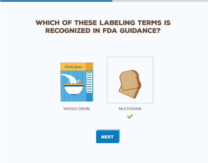
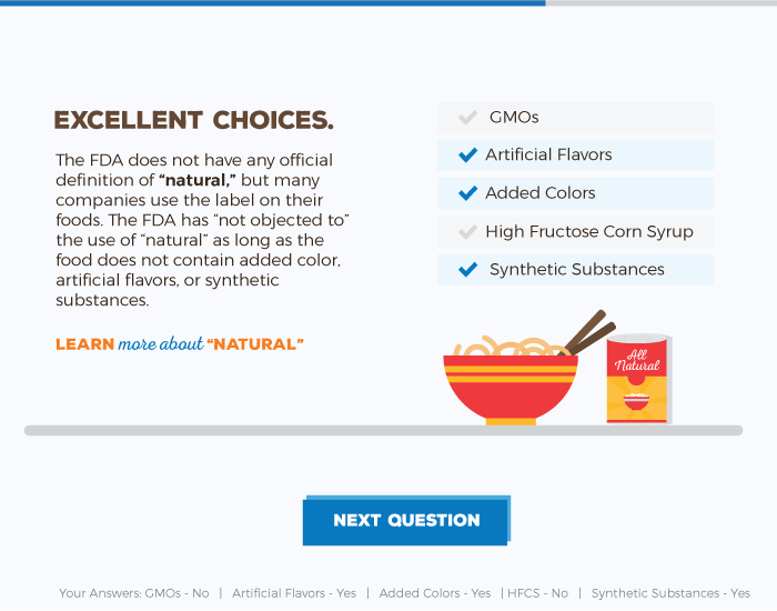
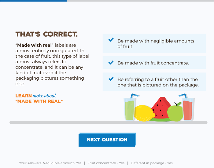
Just how truthful are food labels? The client for this project (2U) did research on how accurate food labels are. My job was to put their findings into an interactive quiz that would live on their blog. I designed & developed this quiz from scratch.
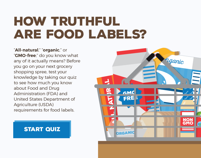
I started by picking out different drawing styles for the food. The client then selected which style they preferred. We ultimately went with a flat, clean style. I drew everything in Adobe Illustrator and then exported the images to be used for coding. Please feel free to take the quiz by clicking the button below. You can view screenshots from the quiz below.
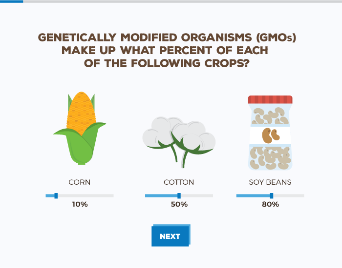
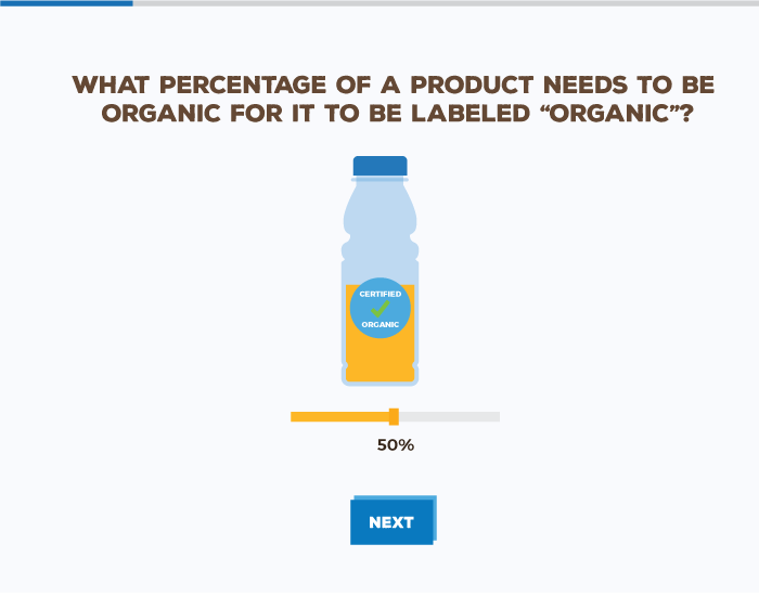
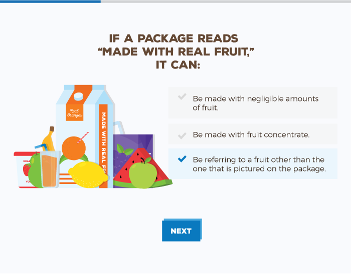
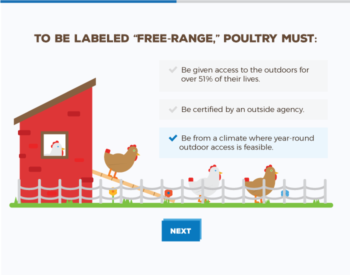
Key features of the quiz: custom illustrations, progress bar, interactive elements, answer feedback, and displaying your answers at the bottom of the screen.
Client: 2U | Date Completed: March 2016
All data can be displayed beautifully, even about really random topics. That was the goal of this mini website. The client designed the PSDs and I brought them to life with code. View the page by clicking the button below
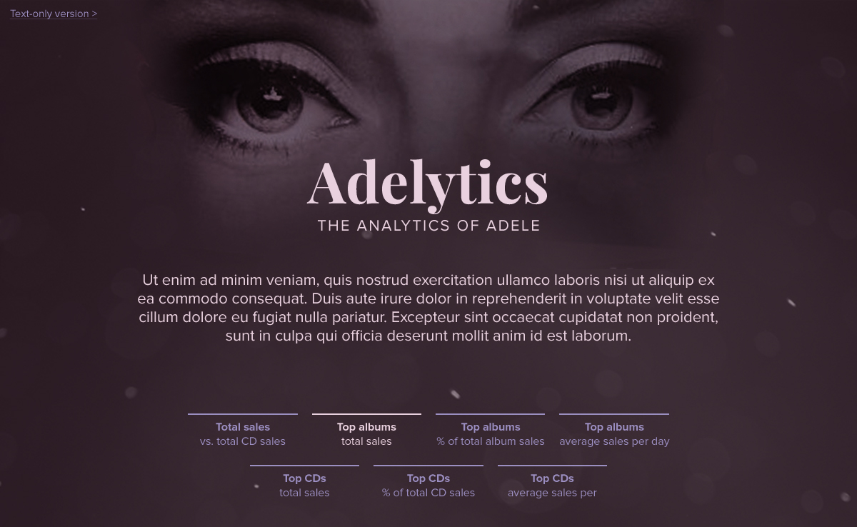
I developed this from scratch utilizing the Bootstrap grid system. I also tested the page on all modern browsers. Key features of the page: animated graphs, responsive design,and subtle hover effects
Client: 2U | Date Completed: August 2016
It's no secret I love designing infographics. So I was delighted when I got not one but two opportunities to design some for Microsoft. The first infographic was used for the 2015 Holiday season to advertise Microsoft software and devices. I was given the text for the infographic, the Microsoft branding guidelines, and had the freedom to design it however I wanted.

The biggest thing here was adhering to Microsoft's branding guidelines. I started by combing through the guidelines and keeping them open at all times while I was designing. After reading the guidelines I sketched out how I wanted the layout to look. I then started bring the sketches to life in Adobe Illustrator.
After completing the holiday infographic, a few months later I was asked to design some infographics focusing on women entreprenuership. The infographics were used in conjunction with an event put on by Microsoft. I kept to the same flat style for these and of course adhered to branding guidelines.


Client: Microsoft | Date Completed: 2015 & 2016
It's no secret I love designing infographics. So I was delighted when I got not one but two opportunities to design some for Microsoft. The first infographic was used for the 2015 Holiday season to advertise Microsoft software and devices. I was given the text for the infographic, the Microsoft branding guidelines, and had the freedom to design it however I wanted.
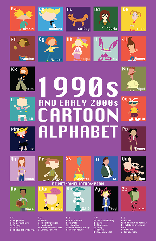
The biggest thing here was adhering to Microsoft's branding guidelines. I started by combing through the guidelines and keeping them open at all times while I was designing. After reading the guidelines I sketched out how I wanted the layout to look. I then started bring the sketches to life in Adobe Illustrator.
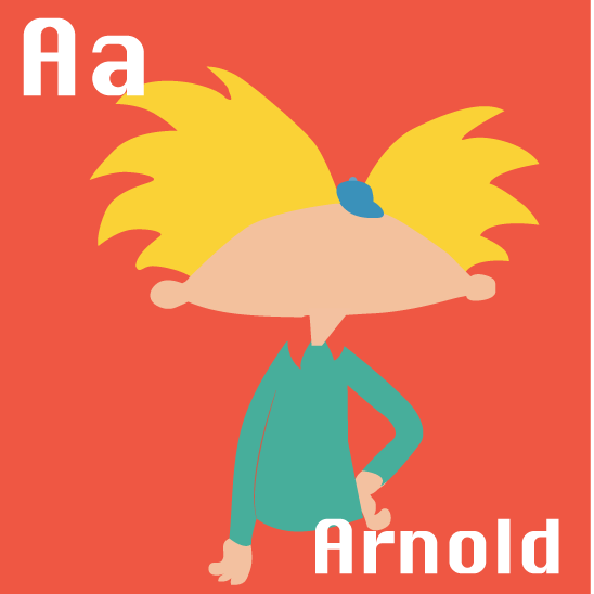
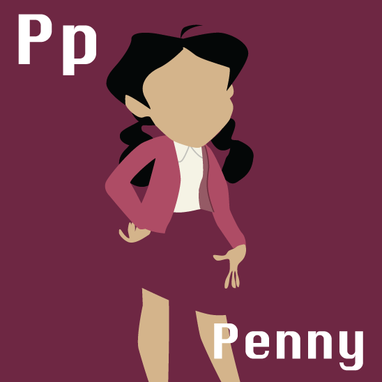
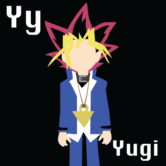
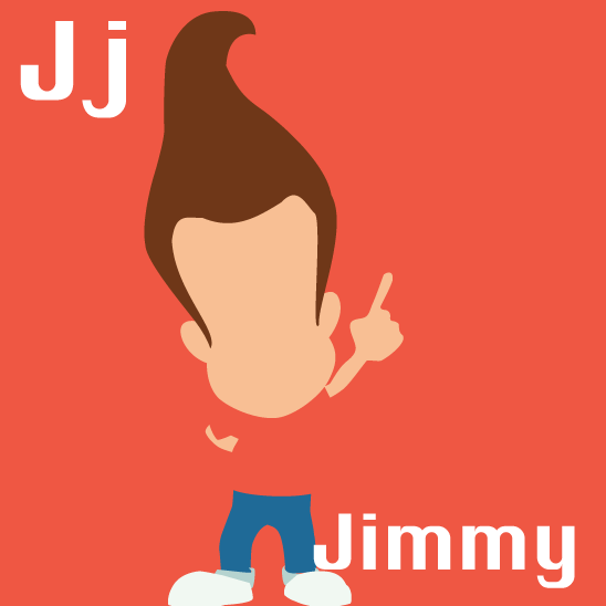
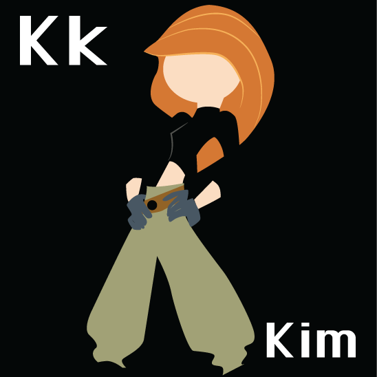
Client: *Personal Project* | Date Completed: 2015
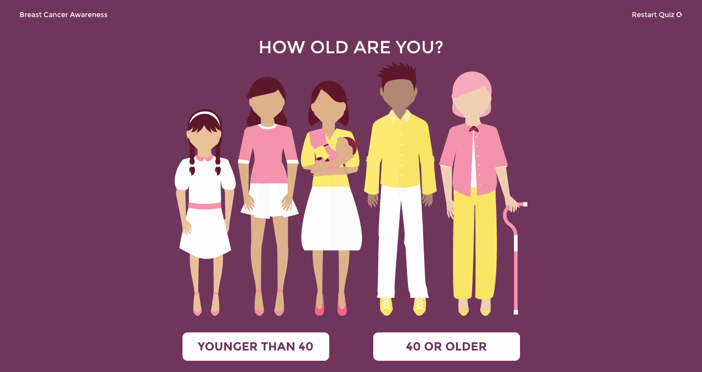
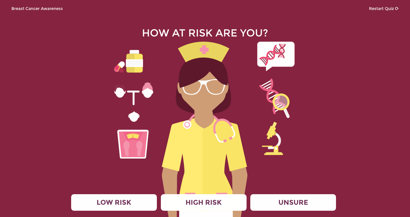
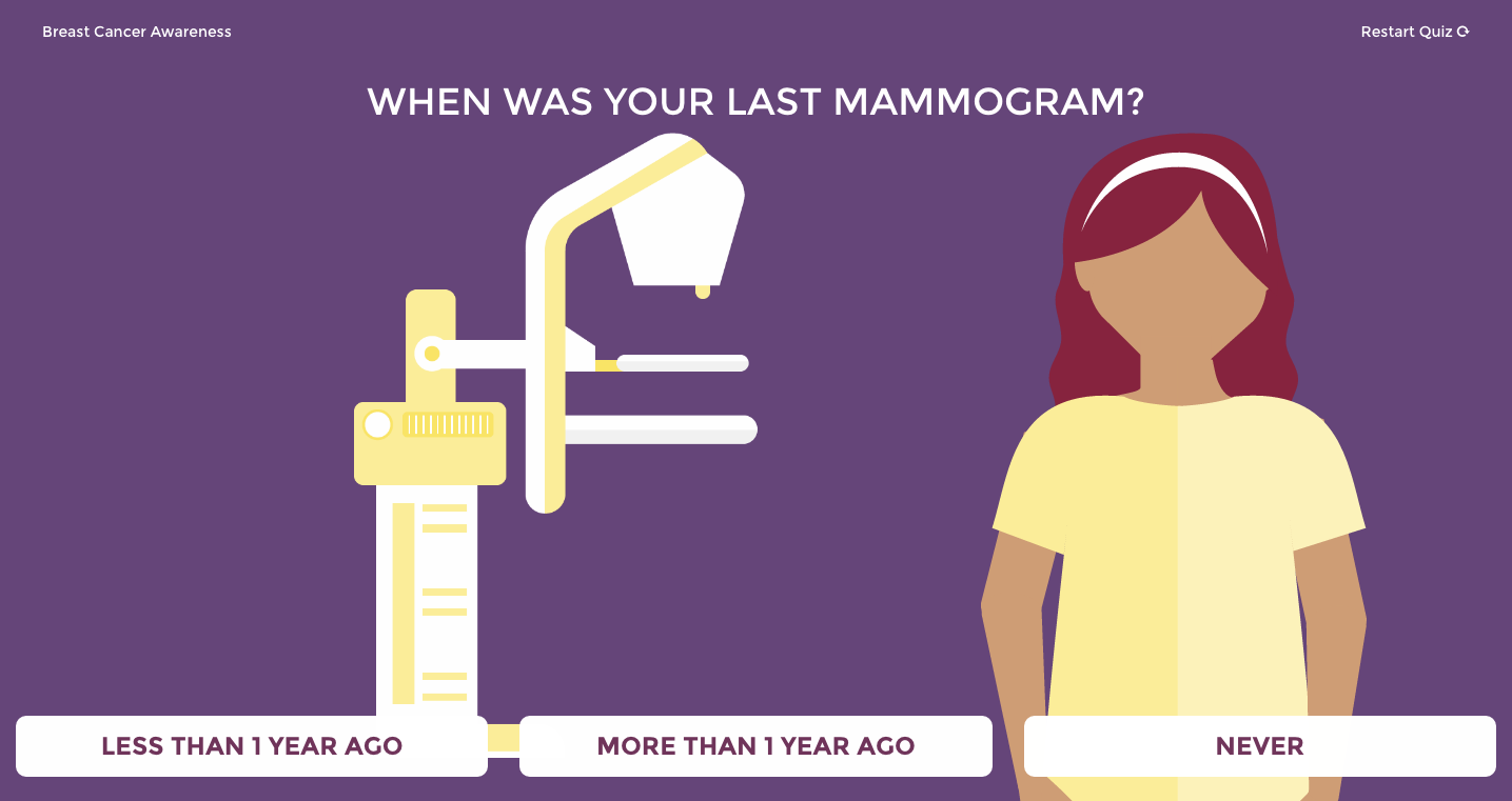
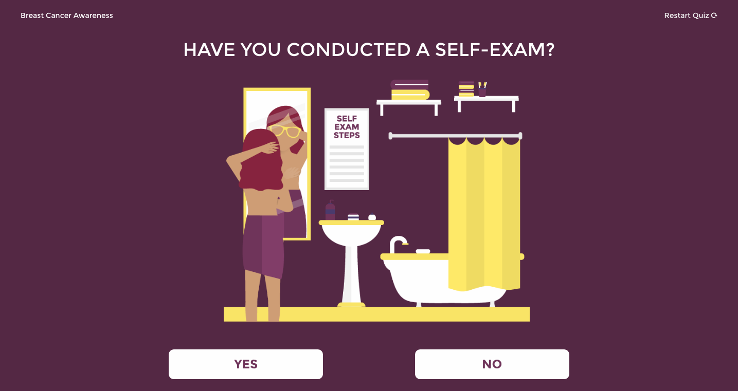
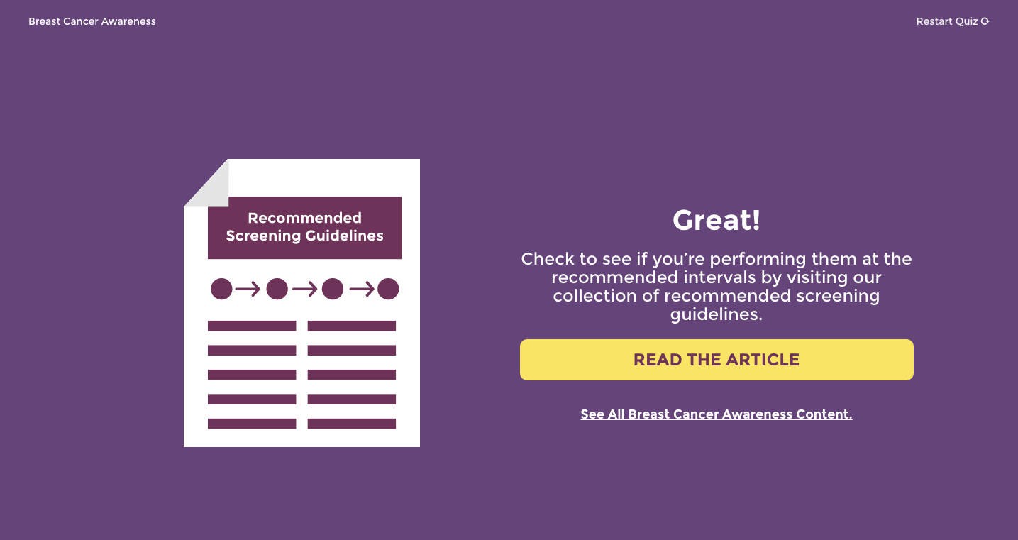
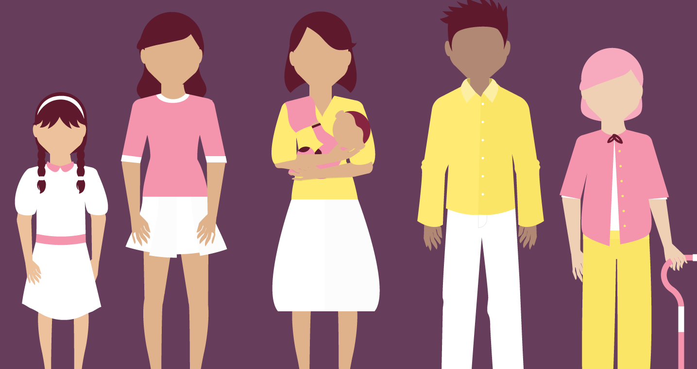
I was the lead designer and developer for this fun infographic quiz. The goal was for the quiz to live on a blog page. I personally illustrated every graphic used in this quiz utilizing Adobe Illustrator. Once I had the color palette and illustration style approved, I began development. Please take the quiz by clicking the button below to see all my illustrations up close and personal. As well as to see how aware you are about breast cancer prevention!
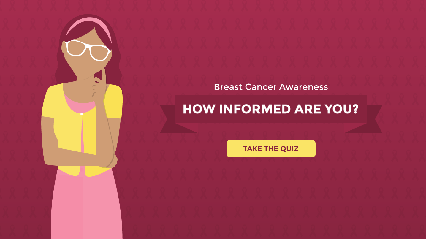
I really enjoyed illustrating the characters in this quiz. It was very fun to create different hairstyles and outfits. Depending on what you choose as your answer for each question, you will receive a different breast cancer awareness article recommendation. The hardest part of developing this was determining all the outcomes for every combination of possible answers.
Client: 2U | Date Completed: October 2015
2U's Social Work License Map wanted to create an infographic to provide a basic guide for social workers in hurricane prone regions about the steps they can take to prepare themselves and their workspaces, and assist their communities in the event of disaster. I was the designer for this project, designing the layout, graphics, selecting fonts, and picking the color palette for this infographic.

In this particular infographic I did not have to adhere to branding guidelines, so I was free to pick any fonts and colors which was nice.

Client: 2U | Date Completed: Feburary 2016
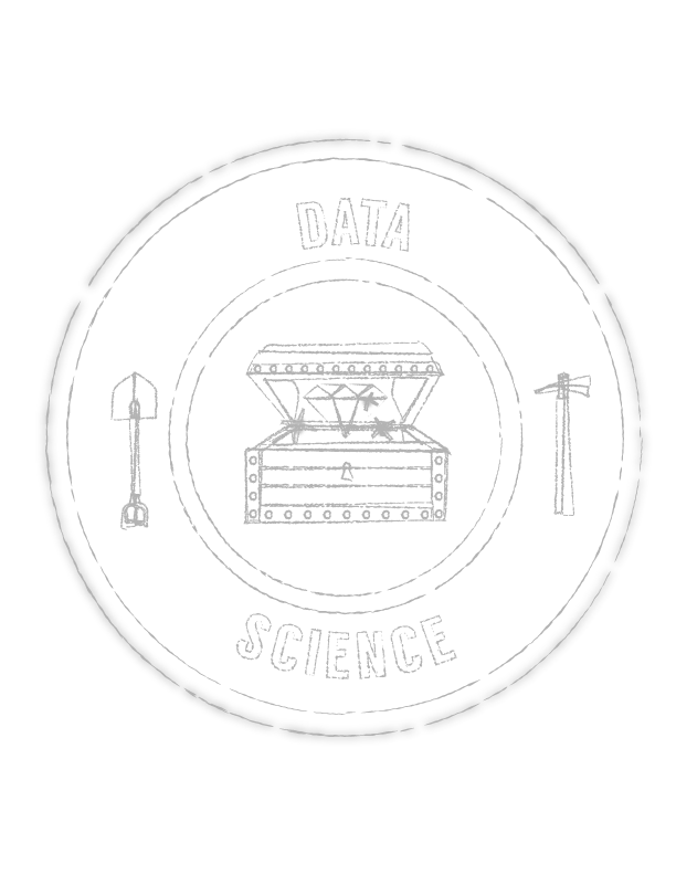
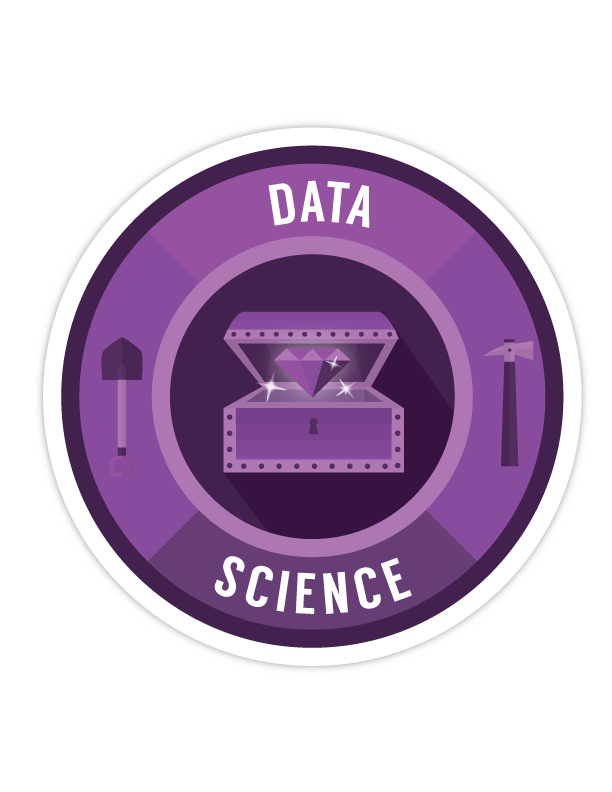
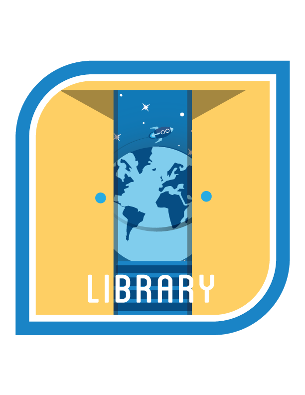
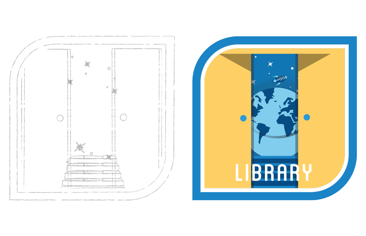
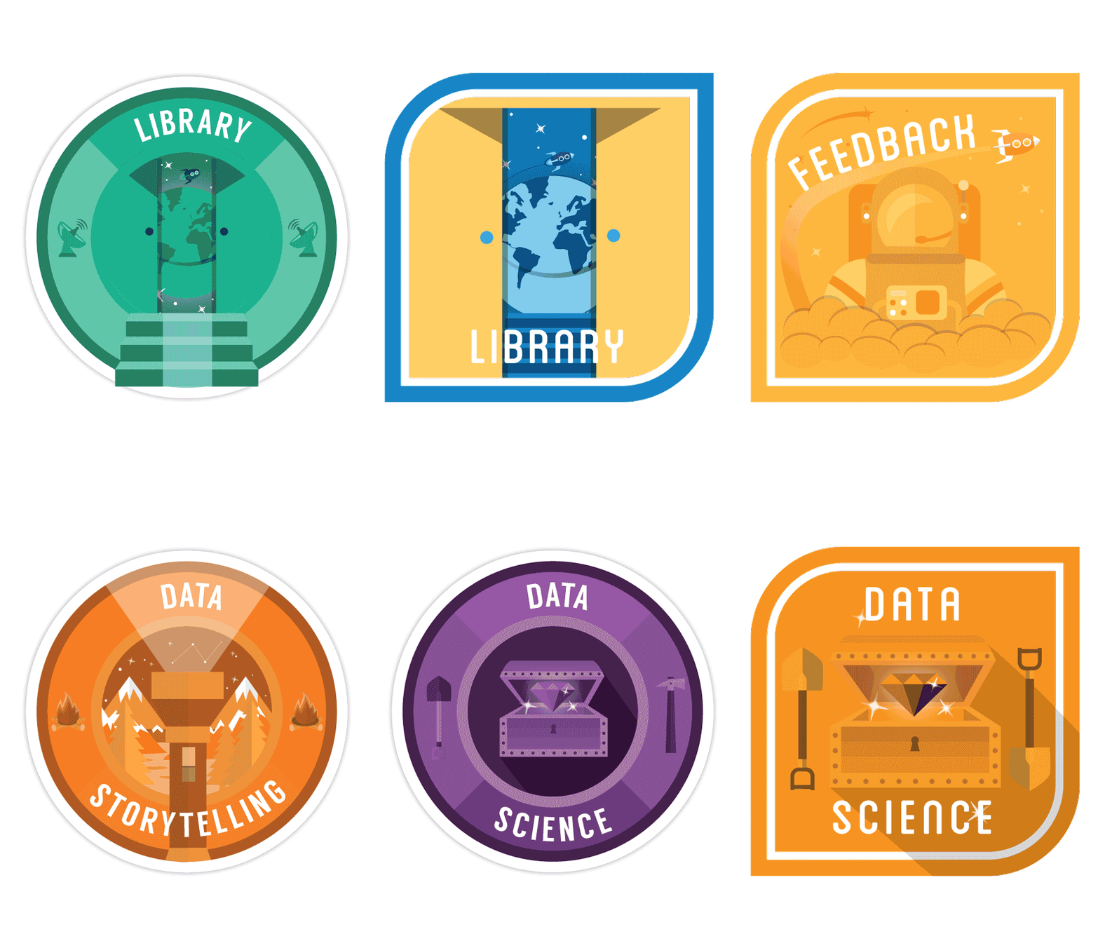
MBLEM is a digital badging program used by the university. Each digital badge contains embedded metadata including details about the criteria, examples of work, and the evaluation process, allowing anyone with Internet access to view and evaluate both the judgment and evidence for each accomplishment, thus increasing the transparency of assessment processes beyond current systems.
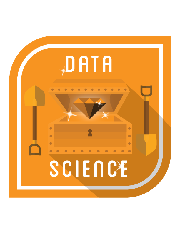
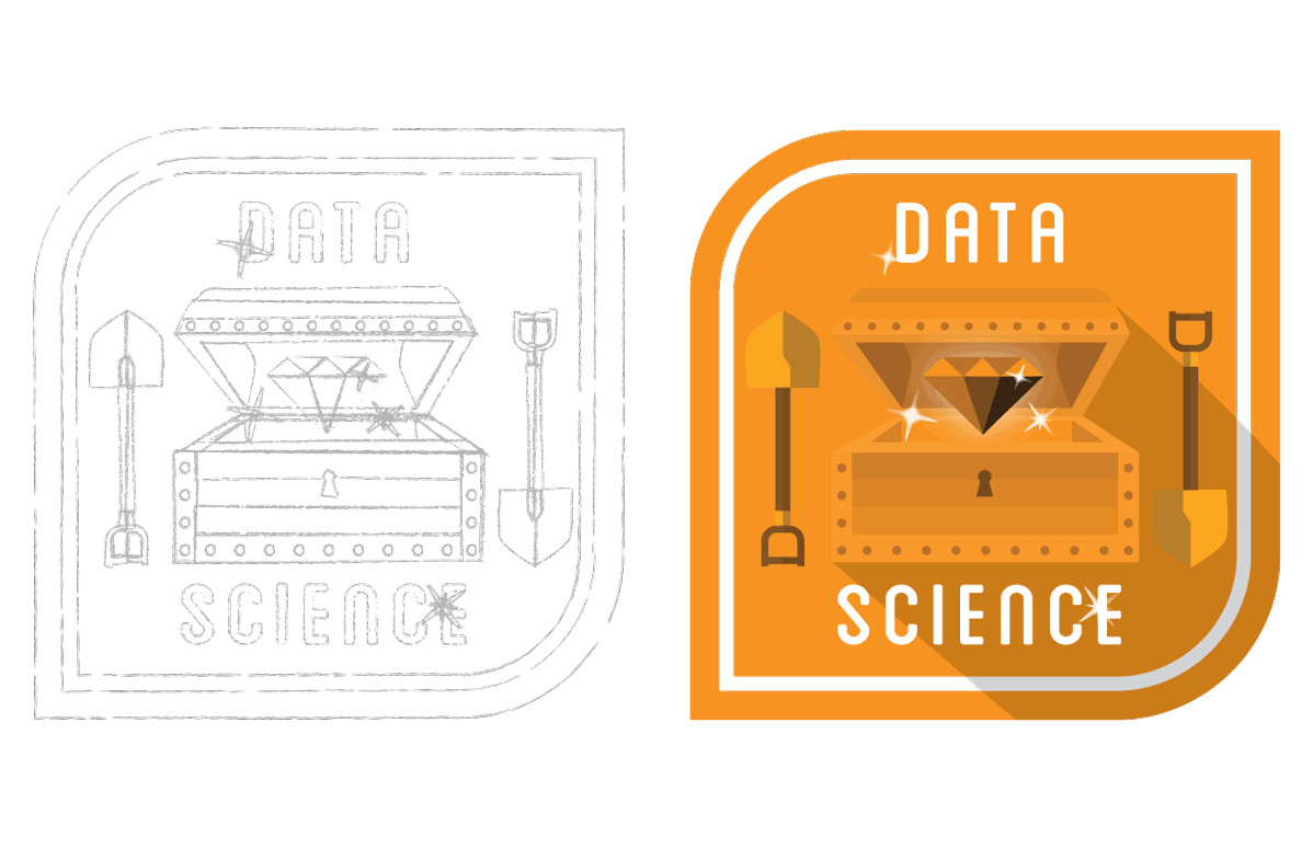
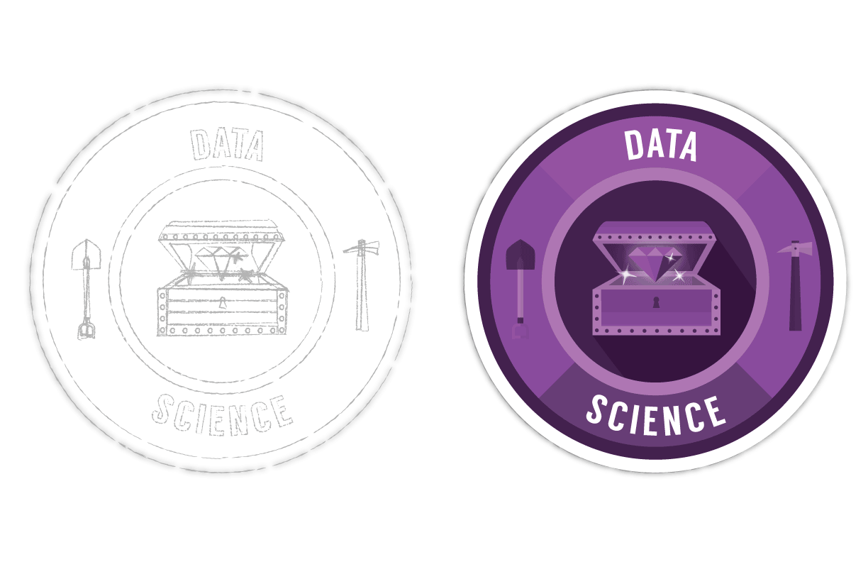
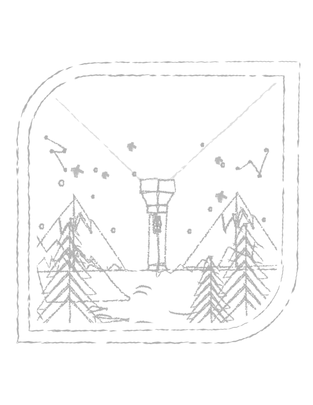
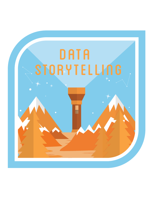
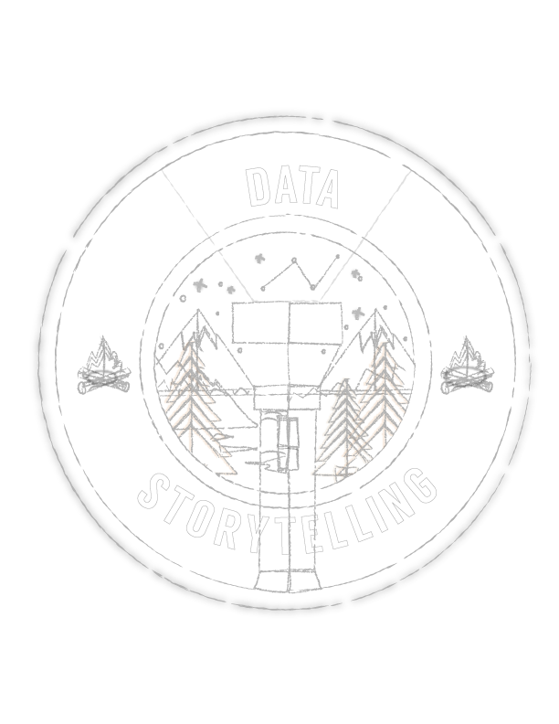
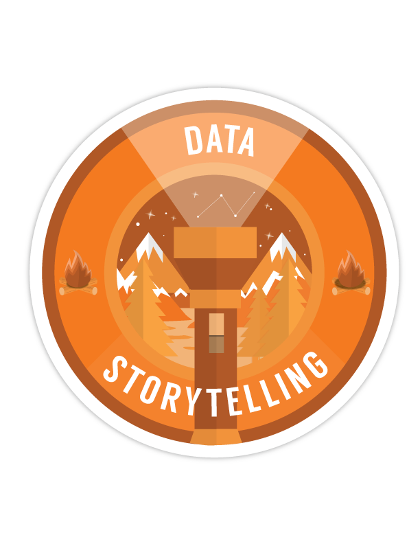
The Task: Design 4 new MBLEM digital badges for data science, library, feedback, and data storytelling. Make two options for each badge, one using the traditional MBLEM badge shape and the other a shape of your choosing.
Definitions from the brief:
Library
- explore the role of the library as an information clearinghouse in modern culture. libraries are for more than just books! libraries are important tools in assisting people with a variety of informational needs.
Data Science - "data science" is a buzzword in the zeitgeist right now. What does it actually mean to be a "data scientist"? What kind of roles does that cover? What skills are needed to fulfill these roles? How can "data science" be made more legible to non-technical people?
Feedback - learning how to give and receive meaningful critical feedback. why important?
Data Storytelling - learn to convey ideas and tell a story with the insights you find in data.
I really enjoyed illustrating the characters in this quiz. It was very fun to create different hairstyles and outfits. Depending on what you choose as your answer for each question, you will receive a different breast cancer awareness article recommendation. The hardest part of developing this was determining all the outcomes for every combination of possible answers.
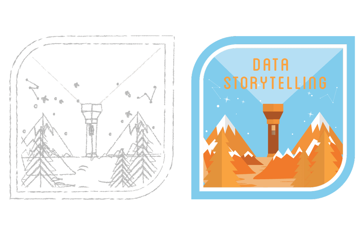
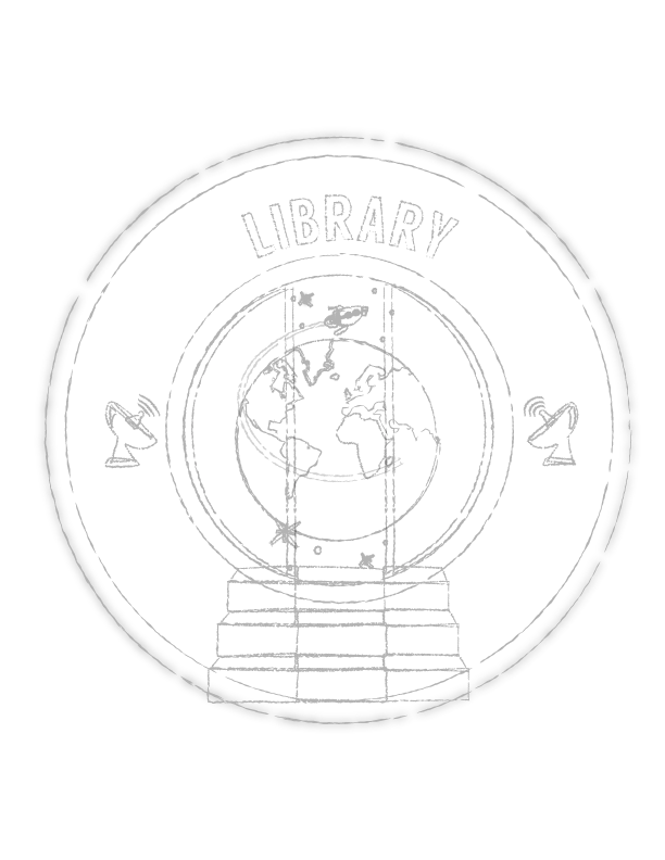
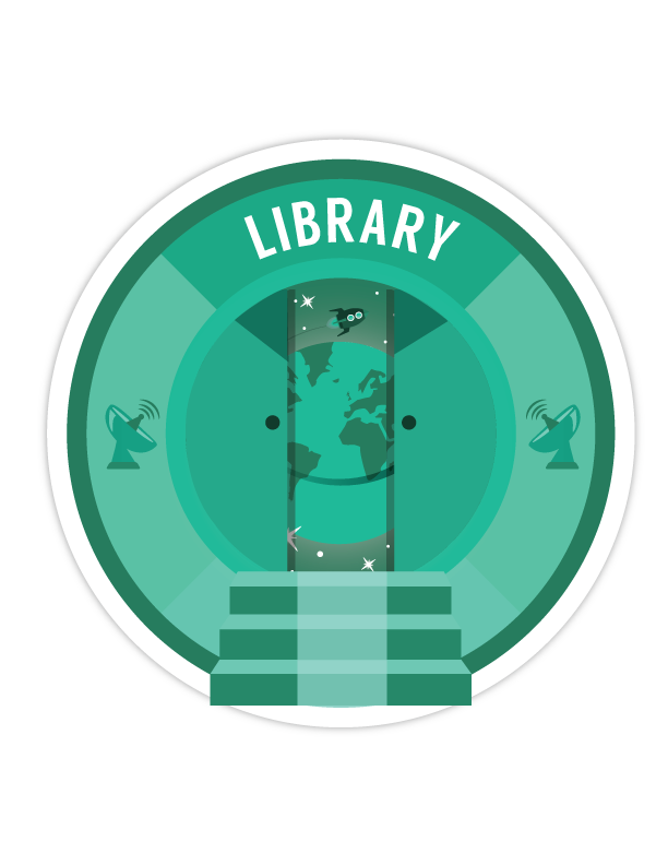
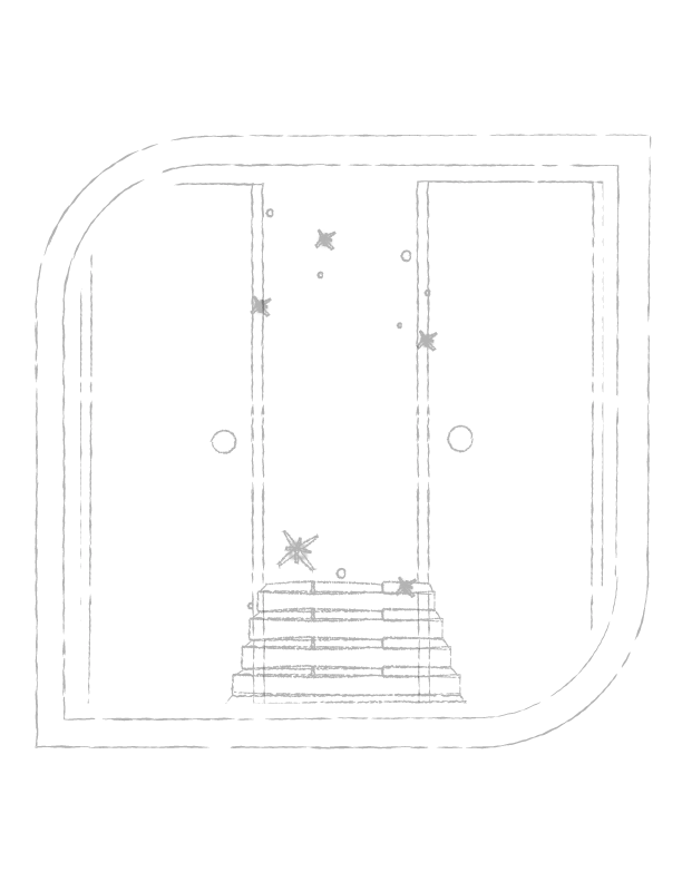
Client: *Personal Project* | Date Completed: 2015
This is a personal project I did just for fun. It is a decorative map of London. I've clearly taken some liberties with placement but I did try to include major landmarks. The full size of the piece is actually that of a billboard. You can view some close ups below.

Client: *Personal Project* | Date Completed: October 2015
I developed and partially designed this short splash page for Facing Addiction. The splash page was used in conjunction with a rally they had. Click the button below to view the page!
Client: Unite to Face Addiction | Date Completed:2015
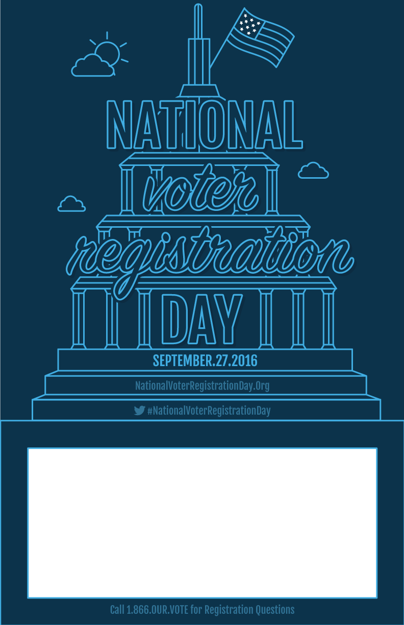
Every year the National Voter Registration Day (NVRD) creates posters to spread awareness about when to register to vote. The posters are used at events in conjunction with NVRD. The target audience for these posters was millennials. With this in mind and using their existing color palette I designed several poster options and social graphics for use on Facebook. I designed many different styles of posters for this. Check out all my original designs as well as the final poster the client decided to go with.
The final two designs the client went with:
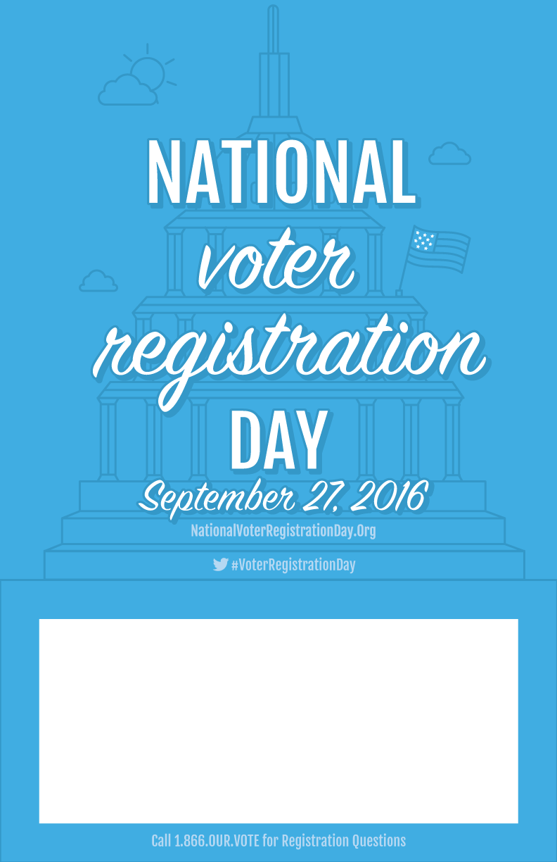
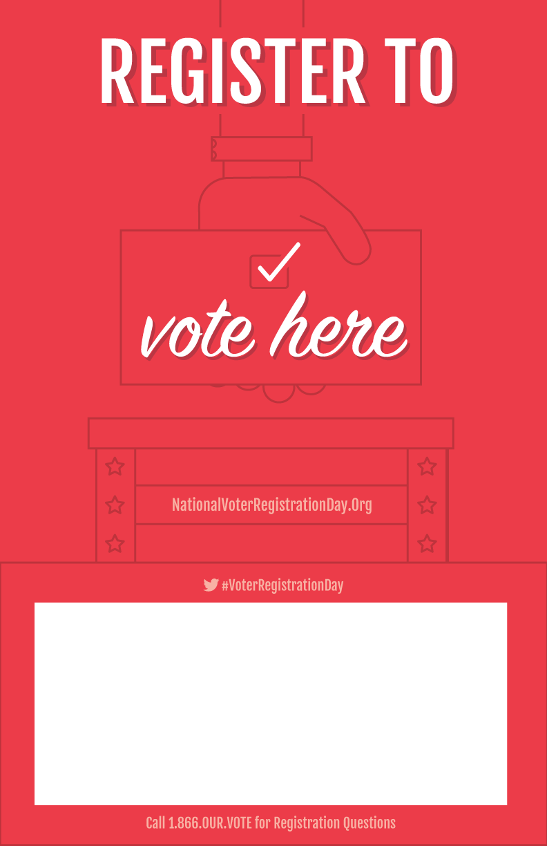
And all my other designs that will never saw the light of day. I personally liked the one with the 'rock on' hand symbol the best.
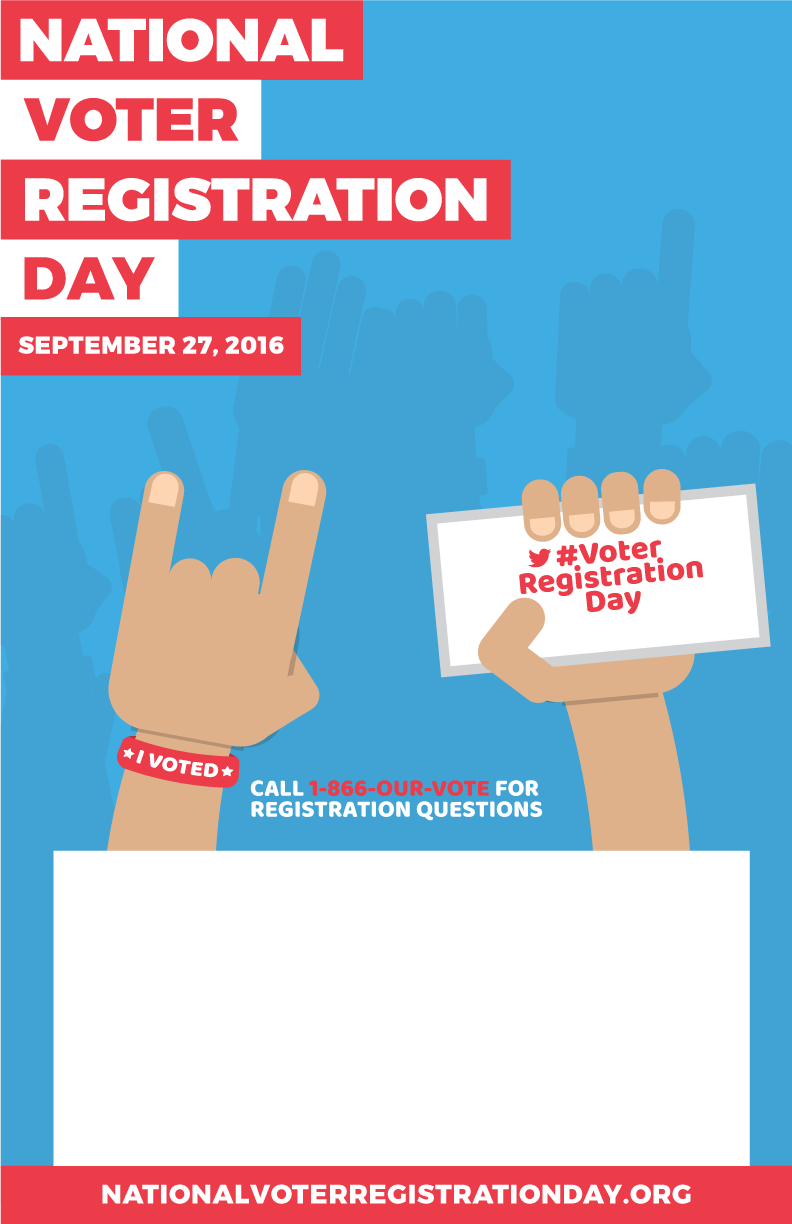
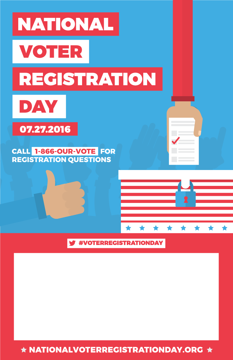
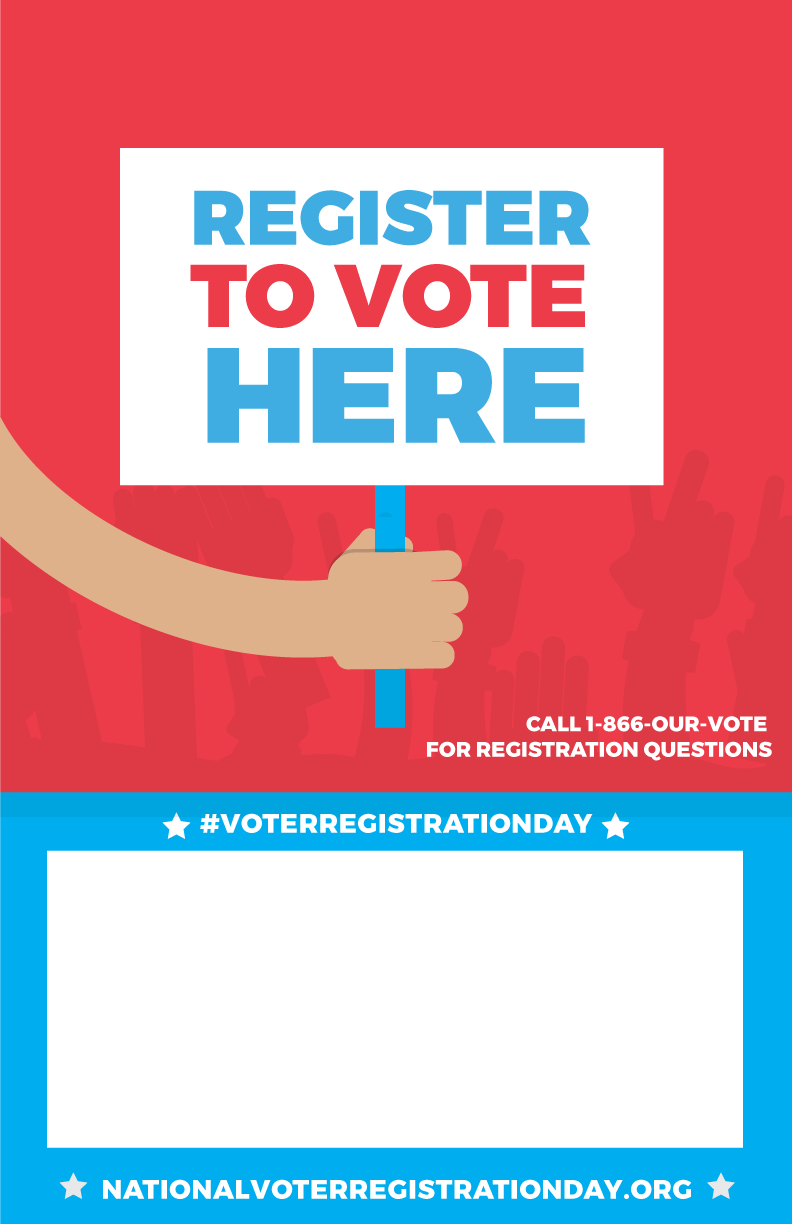
Below are a few of the social graphics that I designed to match the final poster designs the client choose.
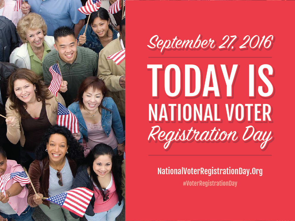
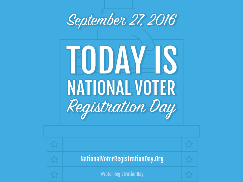
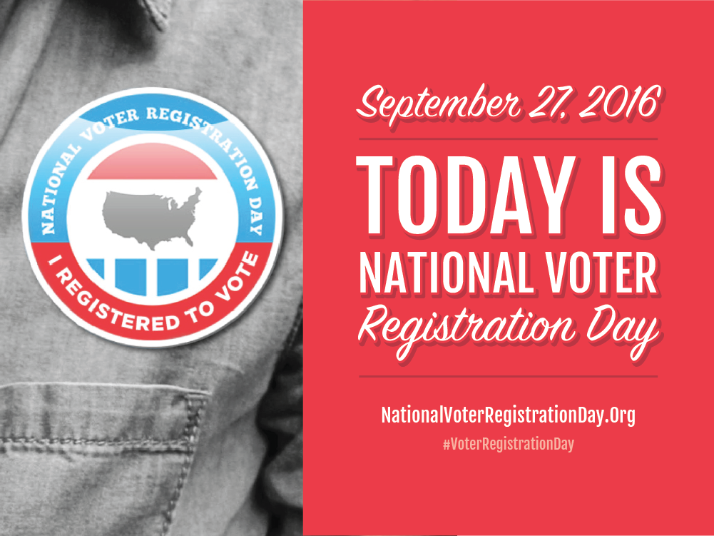
Ultimately the final posters were translated into several languages so they could be used in various countries. As always, don't forget to vote!
Client: National Voter Registration Day | Date Completed:July 2016
I was given the PSDs for this page and brought it to life with code. The key elements of the page are the sticky side nav, responsive mobile nav with sharing icons, responsive map design, interactive map, and animated side bar captions. Check it out yourself by clicking the button below!
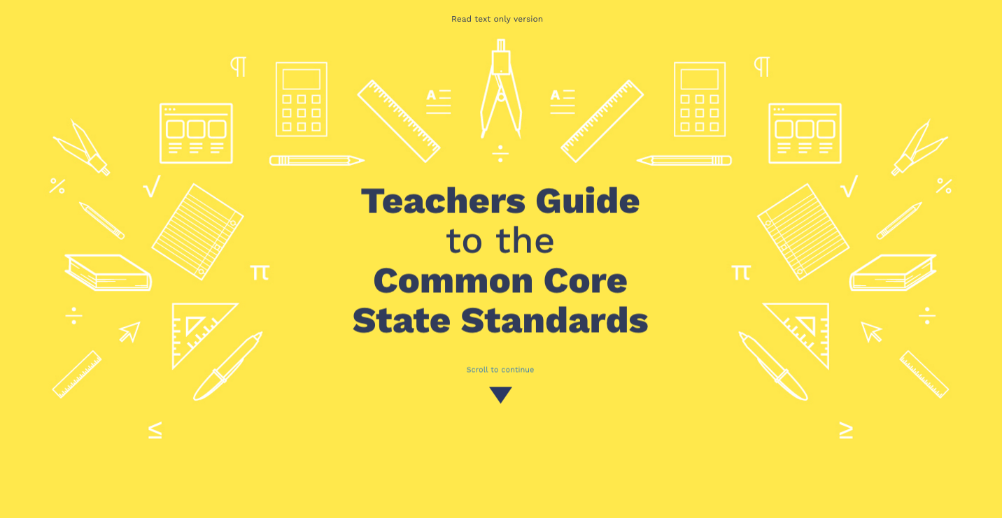
Client: 2U | Date Completed:October 2016
Be Nice. This simple statement with a much deeper meaning was at the heart of this poster design. My task was to illustrate a quote by Sandy Hook Elementary principal, Dawn Lafferty Hochsprung. I tried to keep the poster playful and airy. I selected colors from the Everytown branding guidelines. The poster design went on to be turned into a t-shirt that was sold by Everytown.
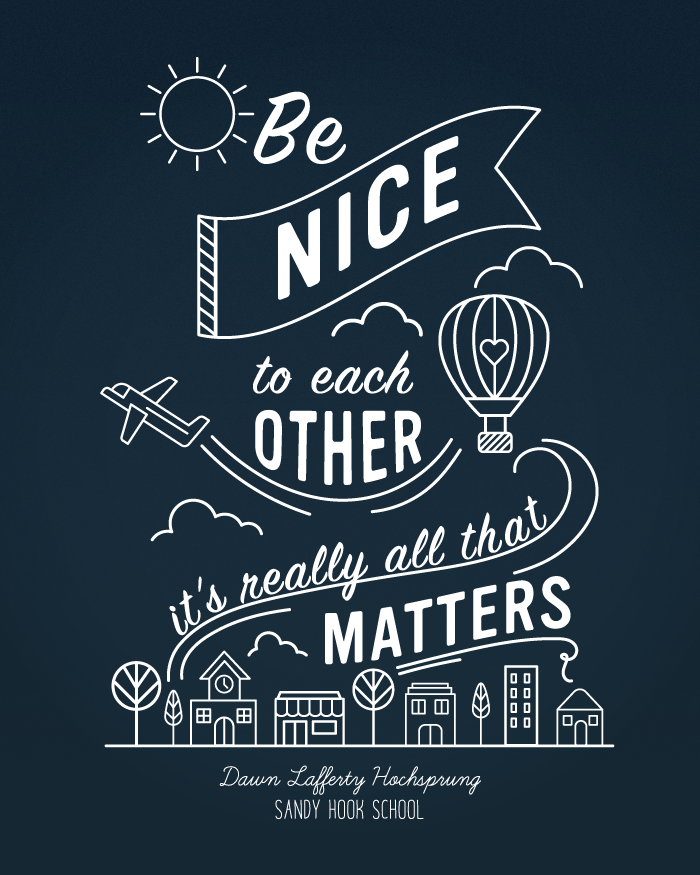
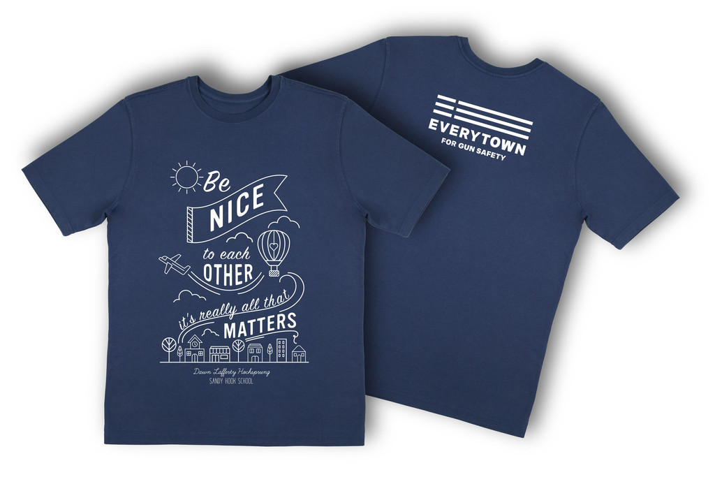
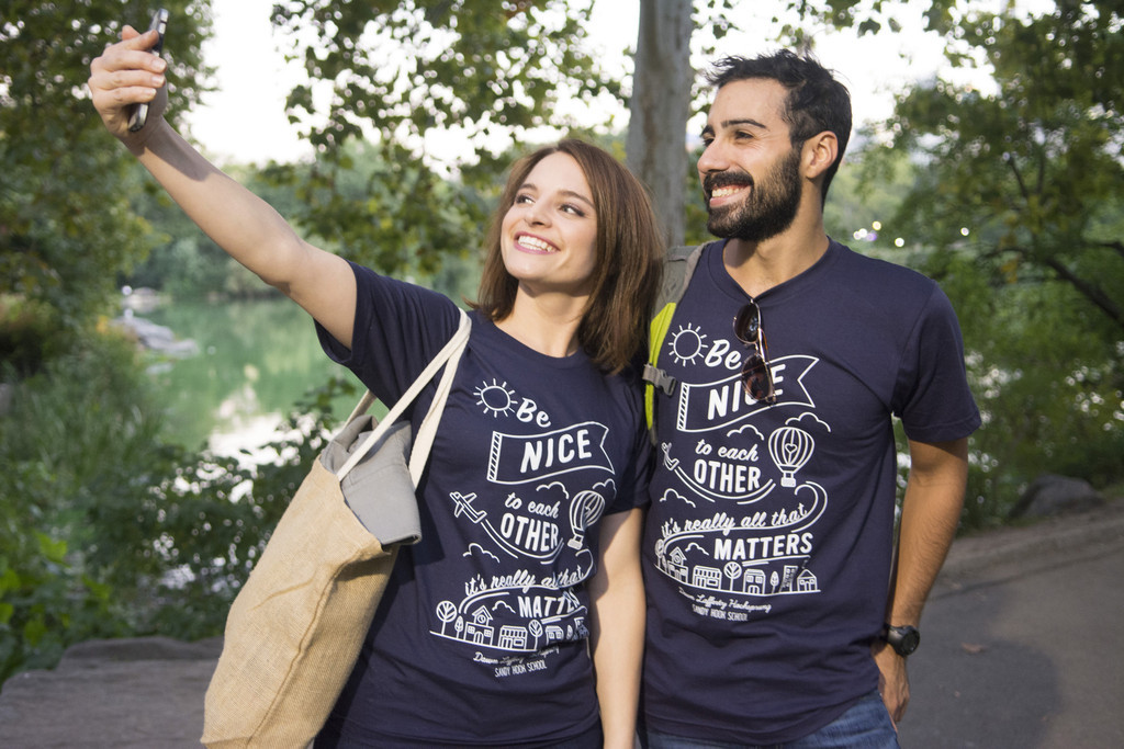
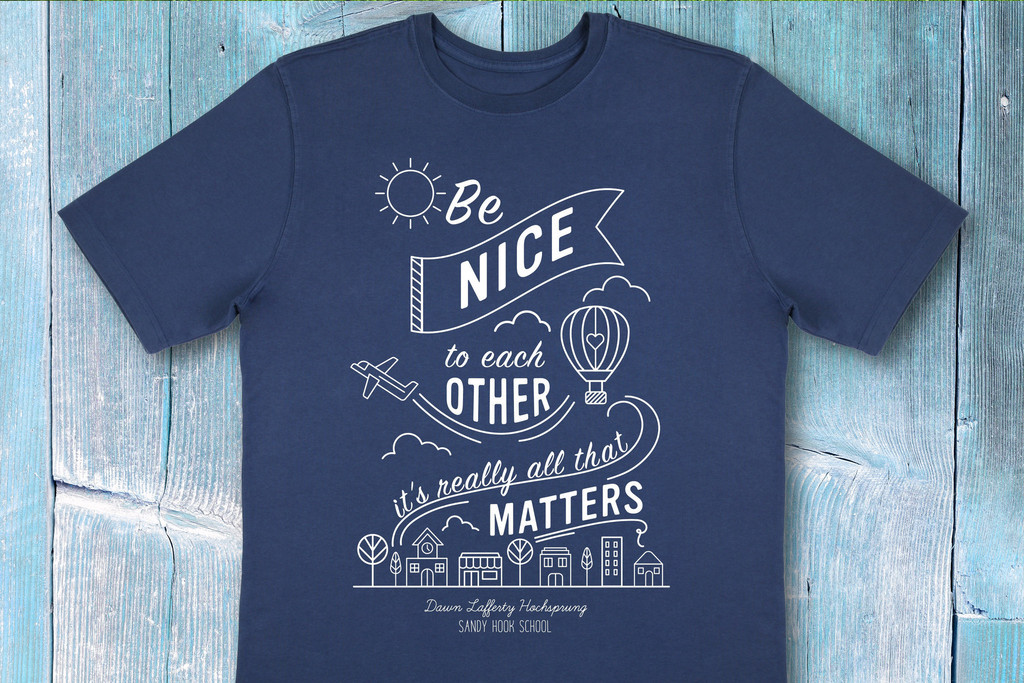
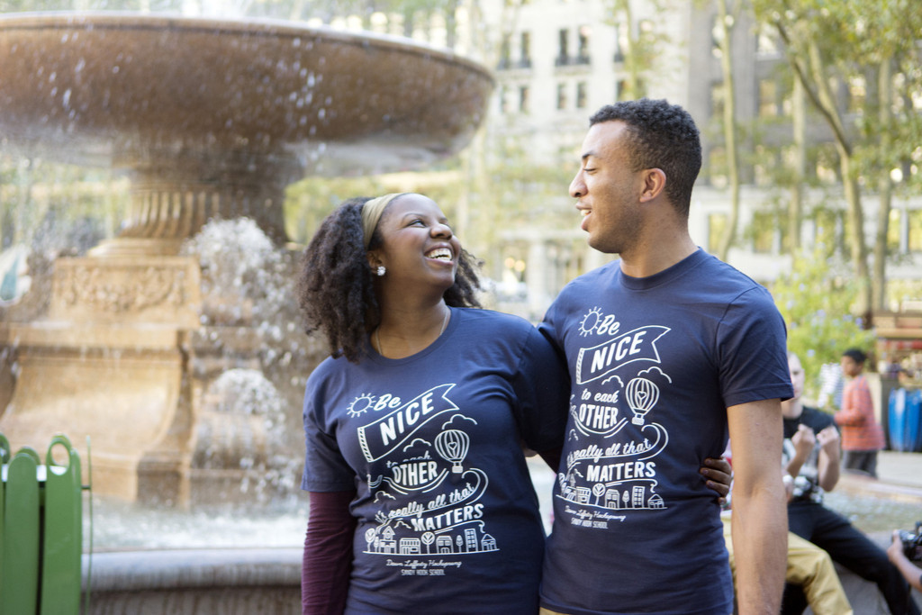
Client: Everytown | Date Completed: 2015
I had the awesome opportunity to design and develop an interactive landing page for Microsoft's Small Business Hub. The main goal of the page is to subtly collect answers to questions through interactive quiz questions. Adhering to brand guidelines, I started by laying out a bare bones wireframe for the page in Adobe Illustrator. From there I experimented with different animations to include on the page. I had a lot of creative freedom with this page in terms of the animations I choose. The only direction was to make it some sort of interactivity that will work smoothly in Internet Explorer. Please view the page by clicking the button below.
Client: Microsoft | Date Completed:November 2016
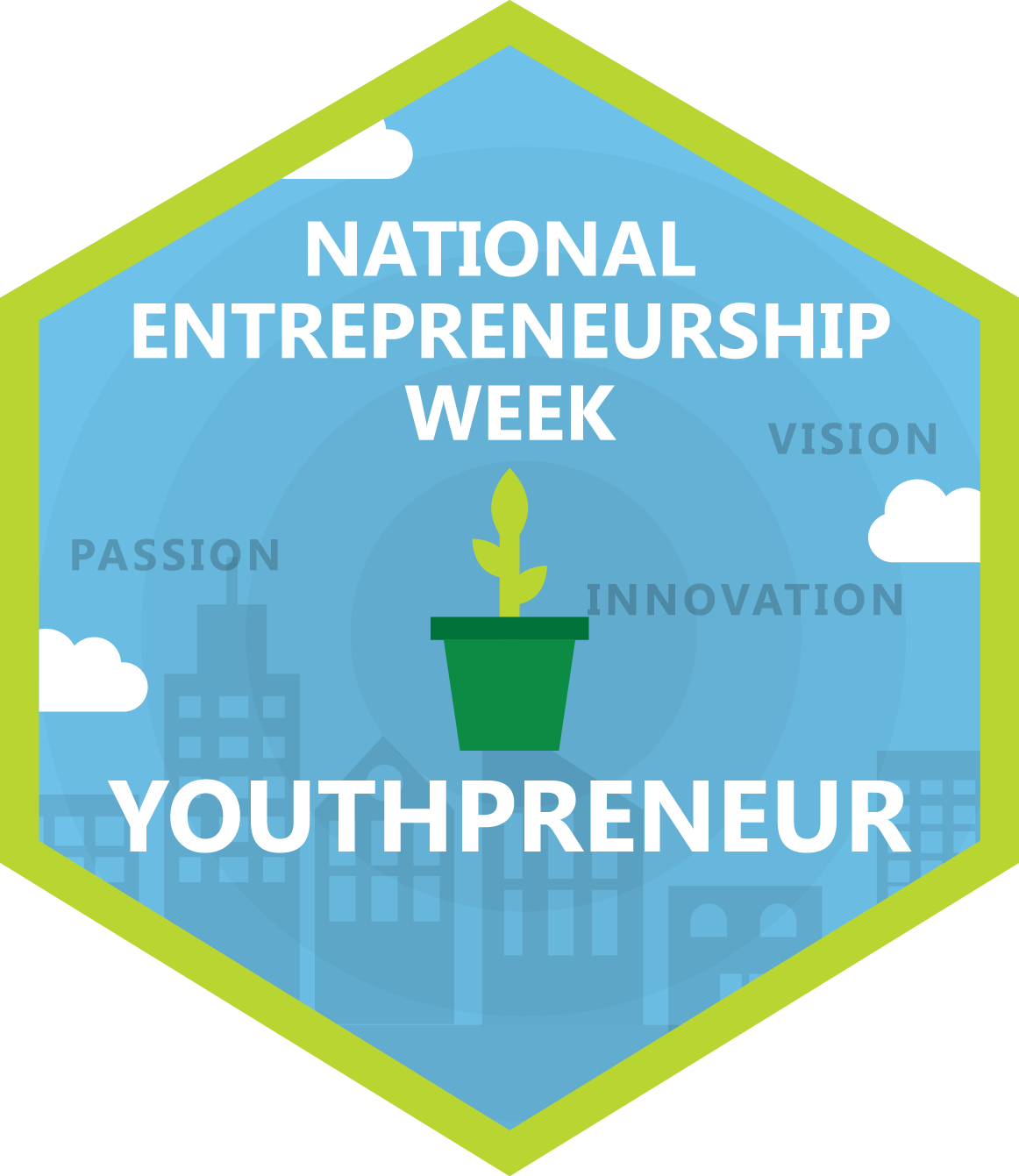
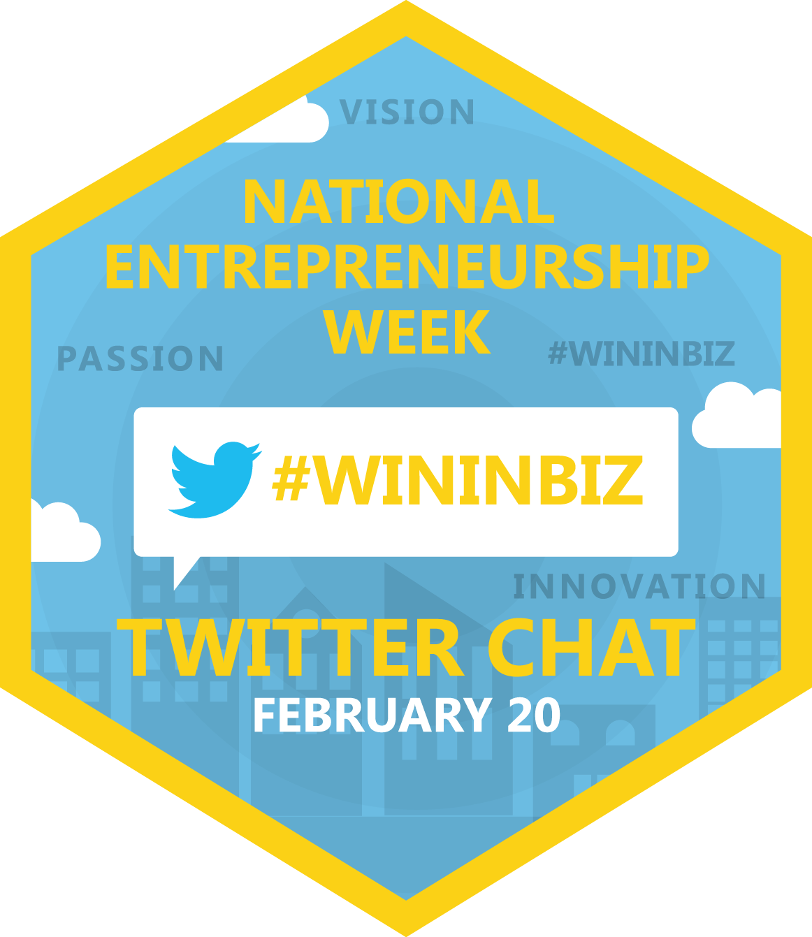
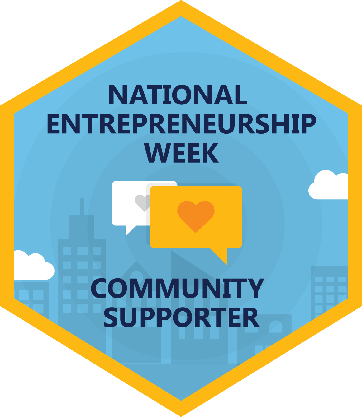
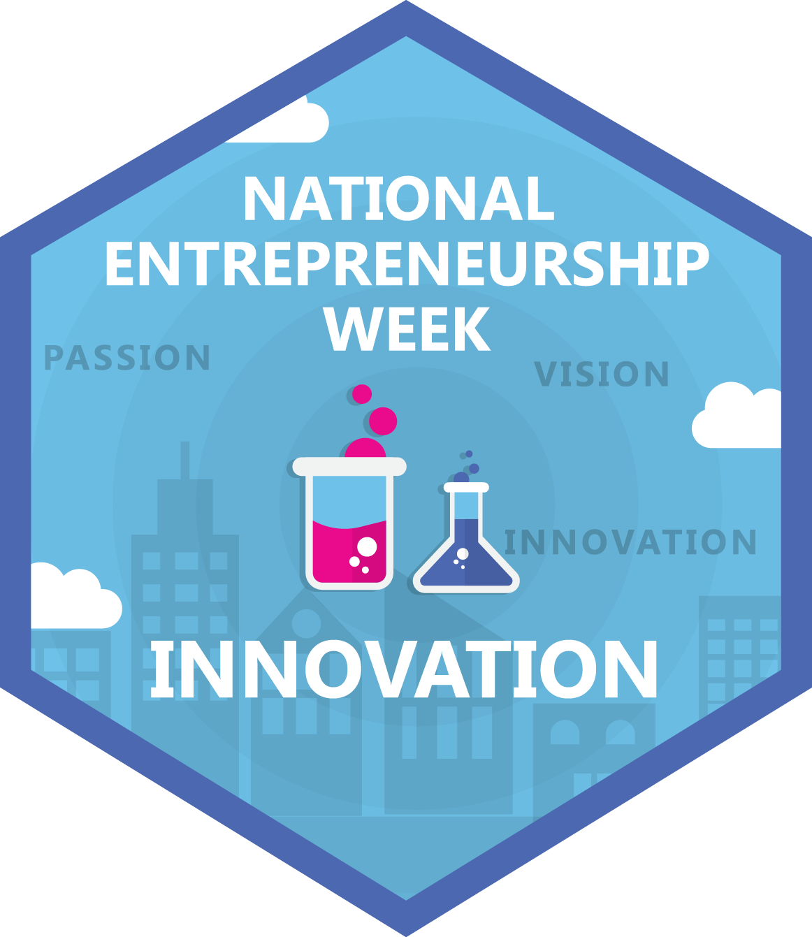
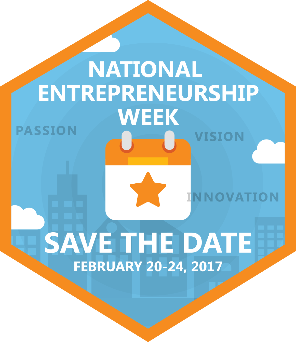
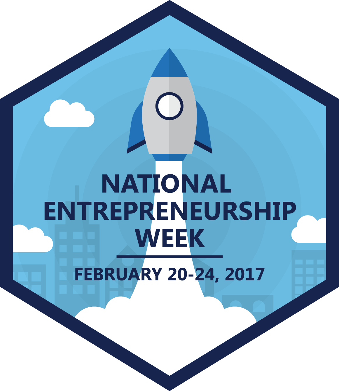
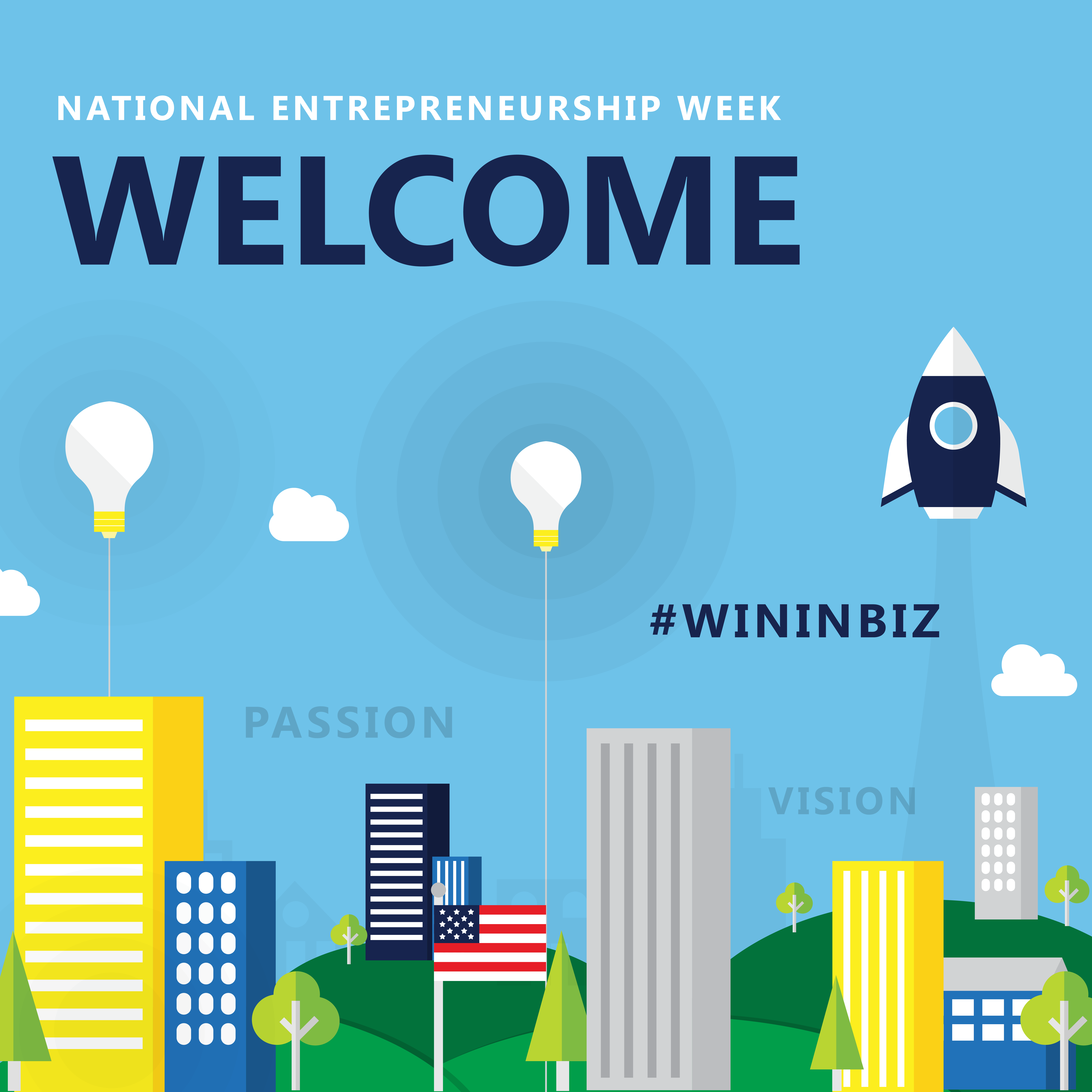
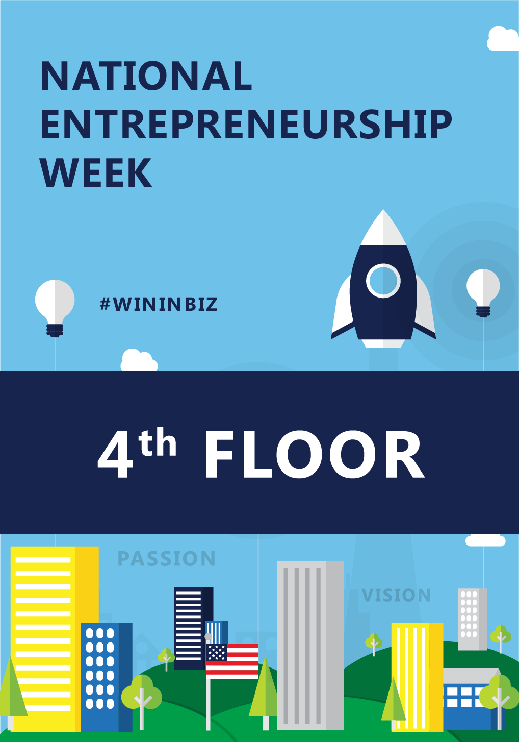
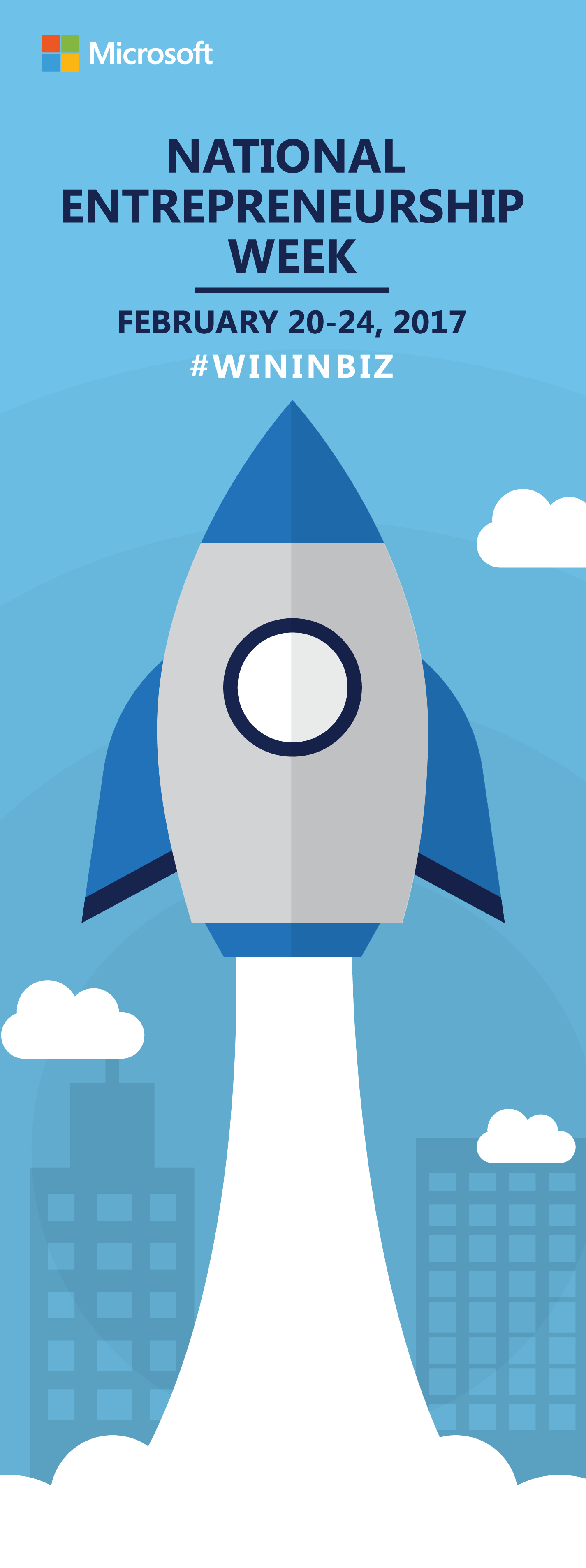
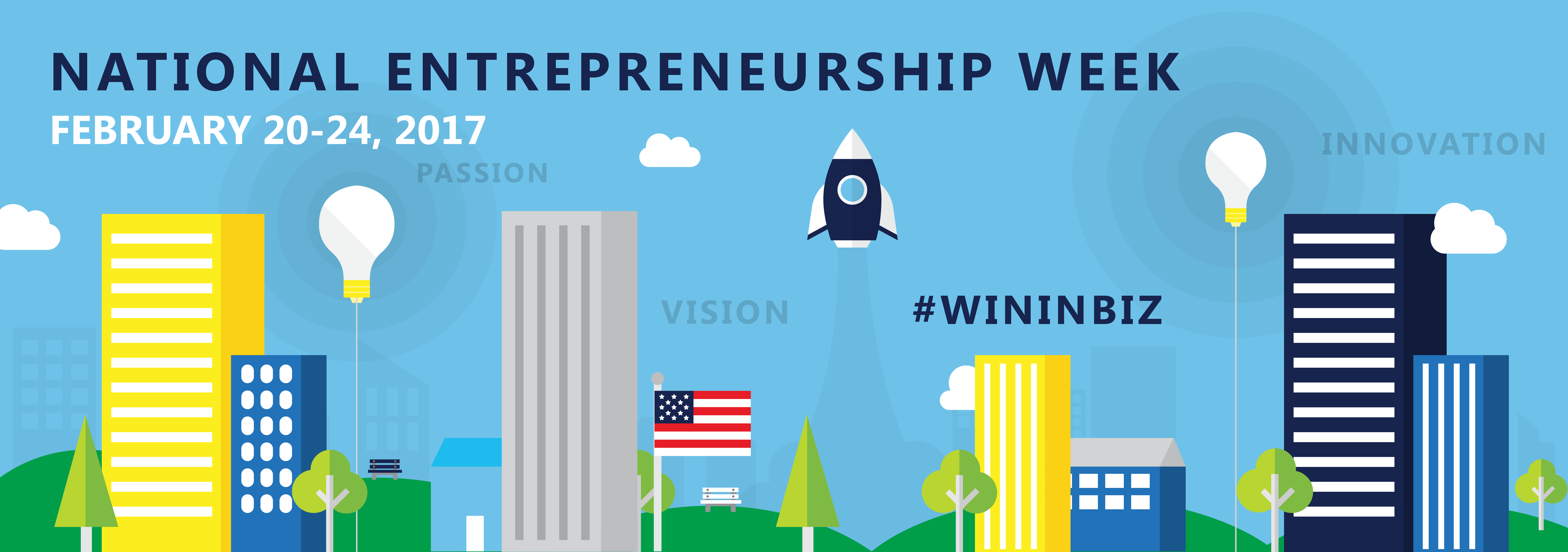
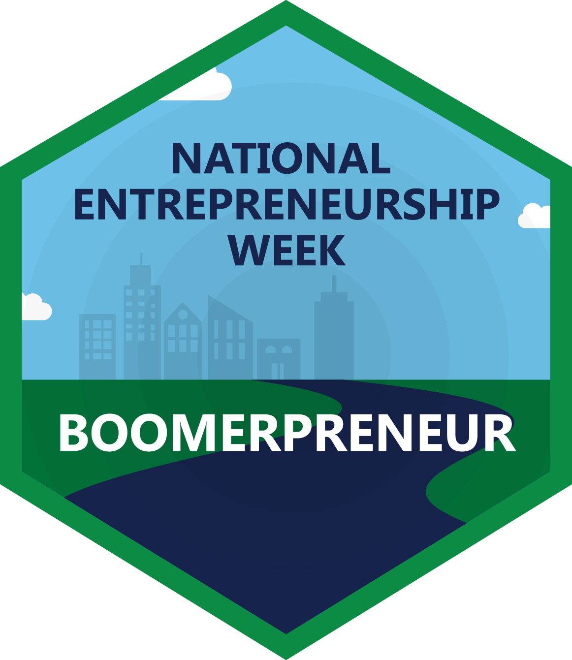
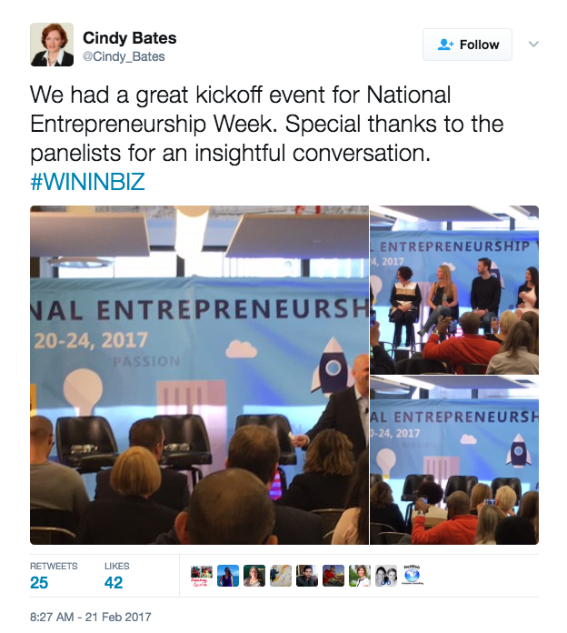
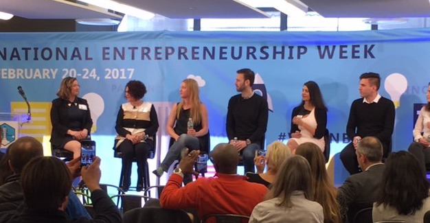
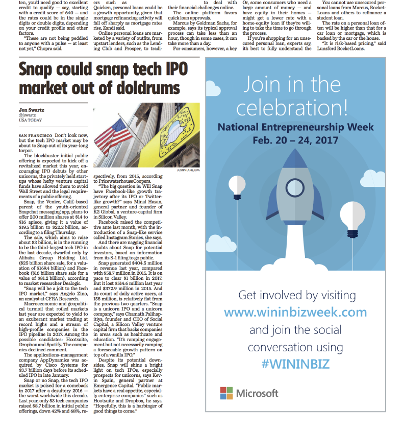
This February I had the opportunity to design the graphics for Microsoft's National Entrepreneurship Week. I designed a suite of badges for each achievement that Entrepreneur's could earn and display on their website. I also designed social media banners, and larger banners to hang at the event Microsoft had to kick off National Entrepreneurship Week. The last graphic was a magazine ad for USA Today to advertise National Entrepreneurship Week. Please view the graphics below.
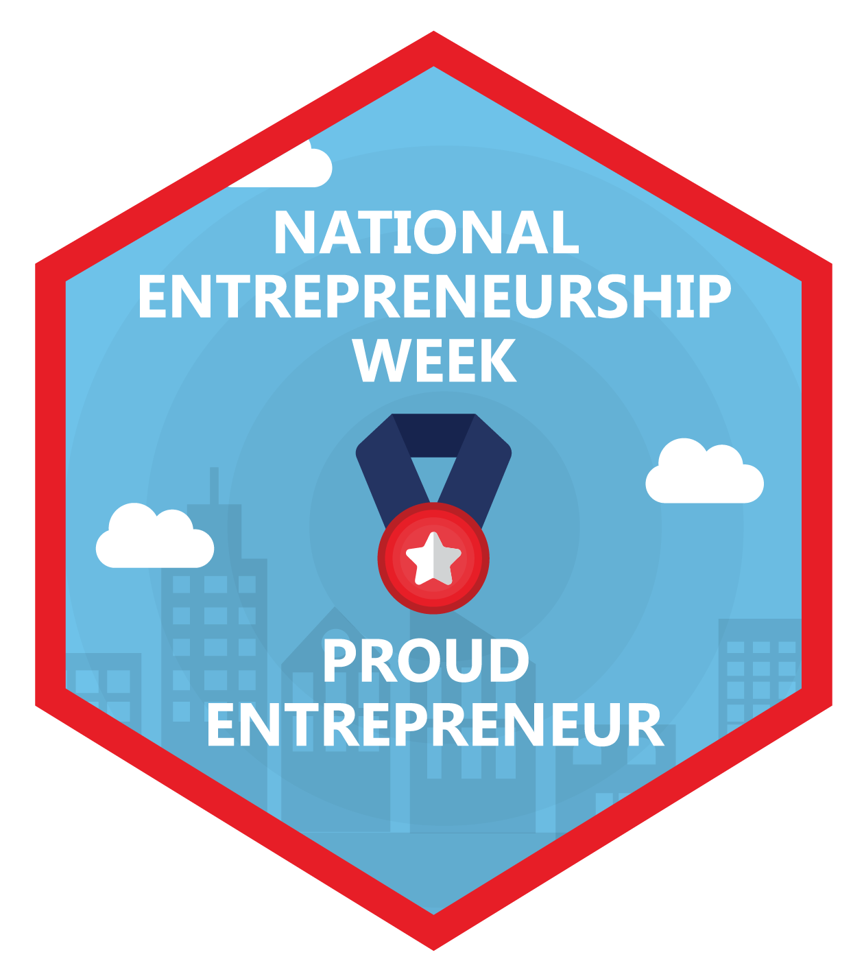
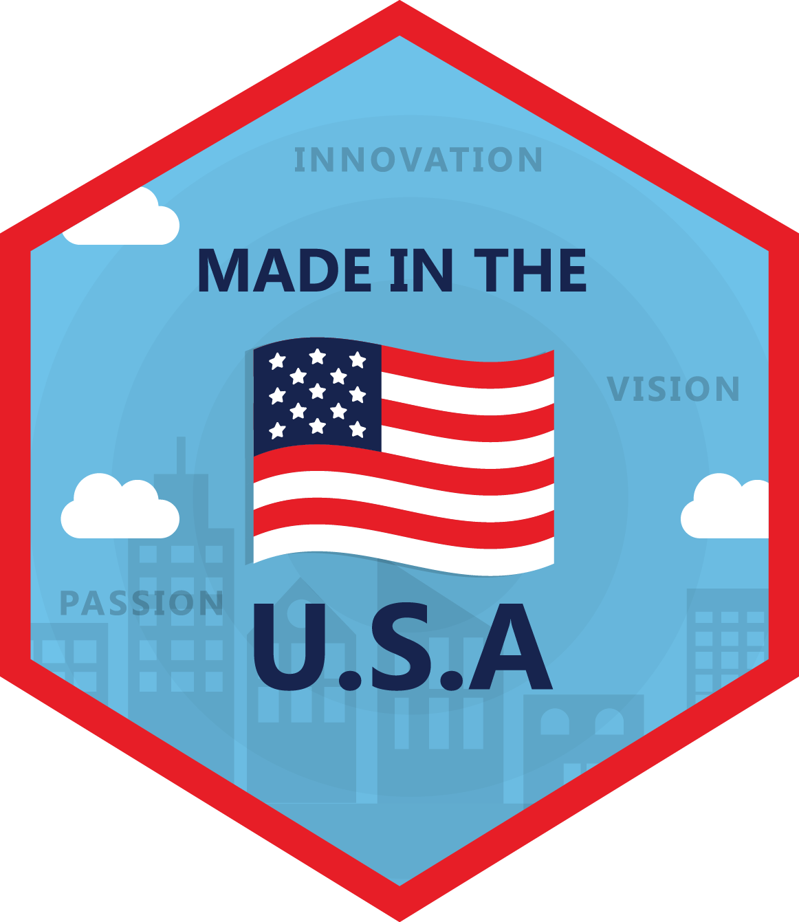

Client: Microsoft | Date Completed:February 2017
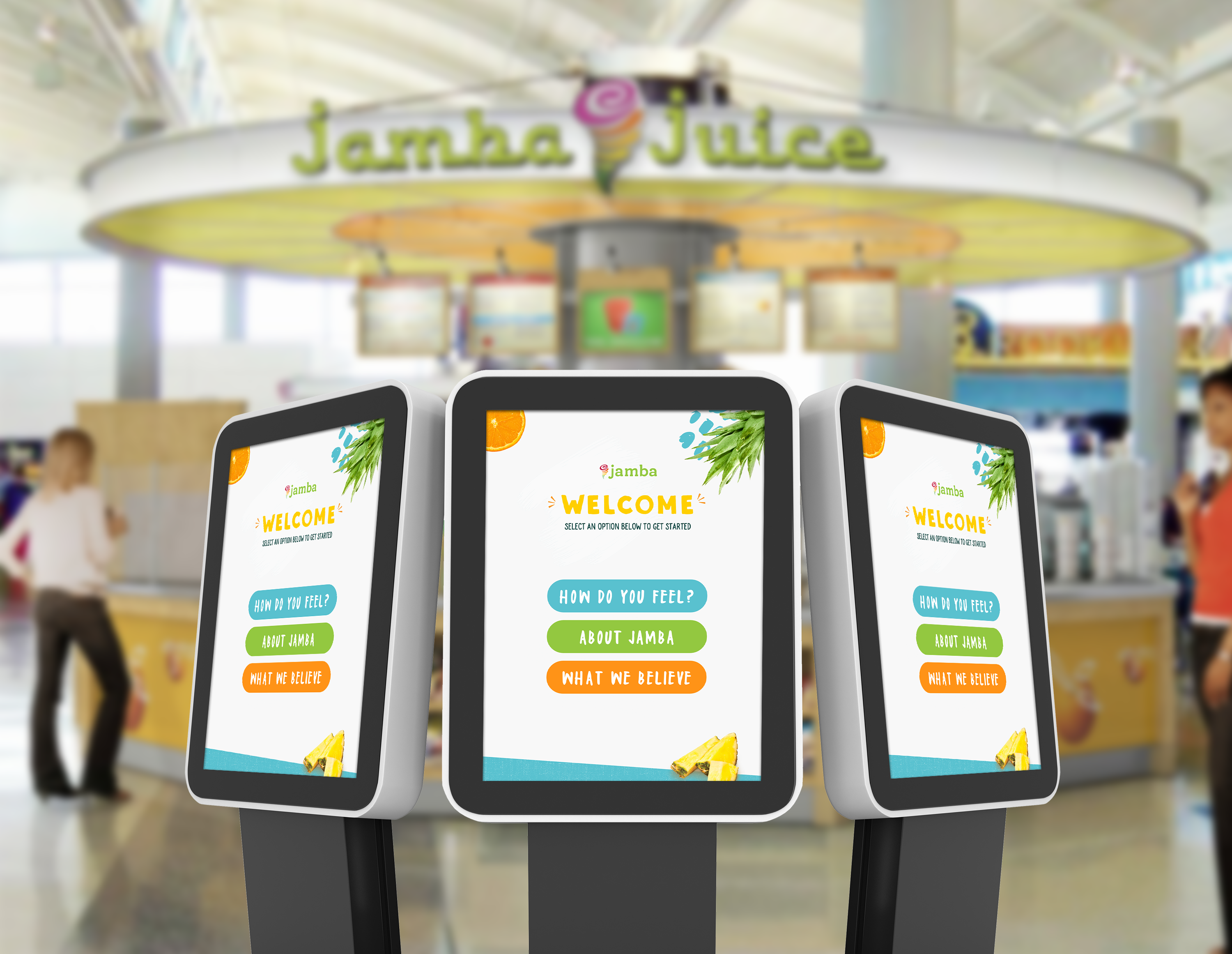
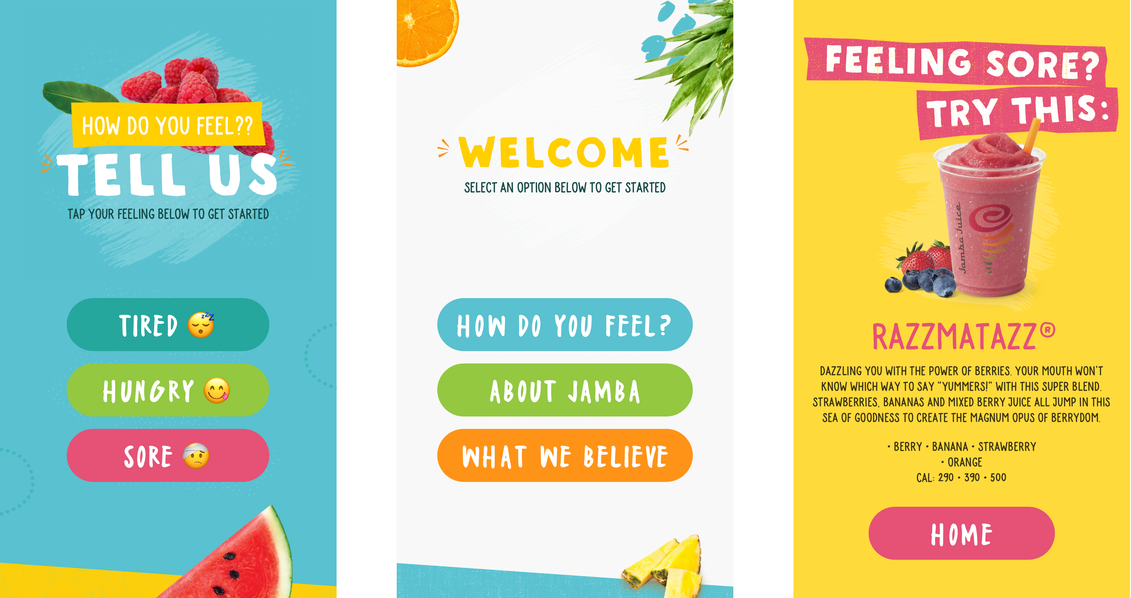
I collaborated with the fabulous UI/UX designer Tania Lee to create this interactive in-store display for Jamba Juice. View the actual application by clicking the button above to see all the screens!
Tania designed the mockups for the display and I translated the mockups into code so it could be interactive and work on the display. This was my first time coding an interactive display as well as my first time coding a project to be compatible with Novari software. Novari is the software used to make the display interactive so customers can click through and engage with the application.
The aim of the display was to gage how customers feel about Jamba, recommend products to them, and give them a bit of history about Jamba.
The display features animated screen transitions, subtle animations, drag and drop features, a timer (to indicate when customers have walked away from the display), and feedback as the customers move through each stage. The full size of the display is 1080px x 1920px and I coded it with HTML5, jQuery, and SASS.
Skills:Development | Client: Jamba Juice | Date Completed:July 2017

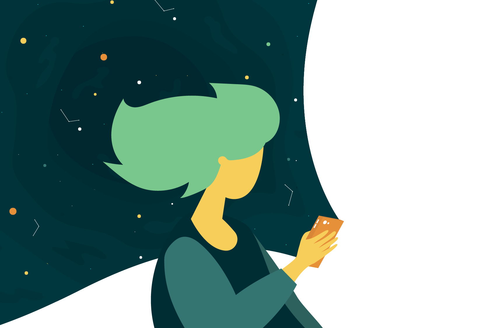
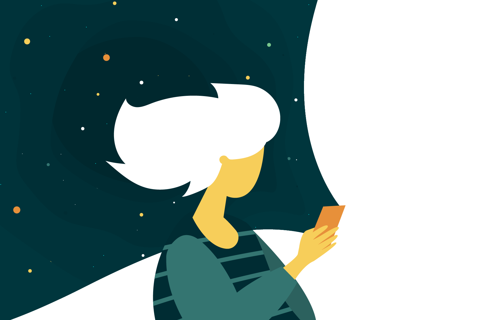
During a brand refresh for the company GetApp I was asked to come up with a few different illustrations to go with the new logo that was created for them. The art director over the project gave me the overall direction of the illustration, she wanted a person looking at a phone with some kind of abstract design coming out of it.
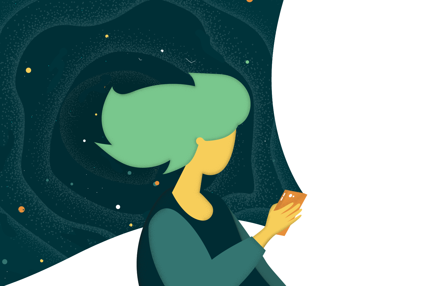
The illustrations have slight variations in color, texture, and small design elements.

Skills: Design | Client: GetApp
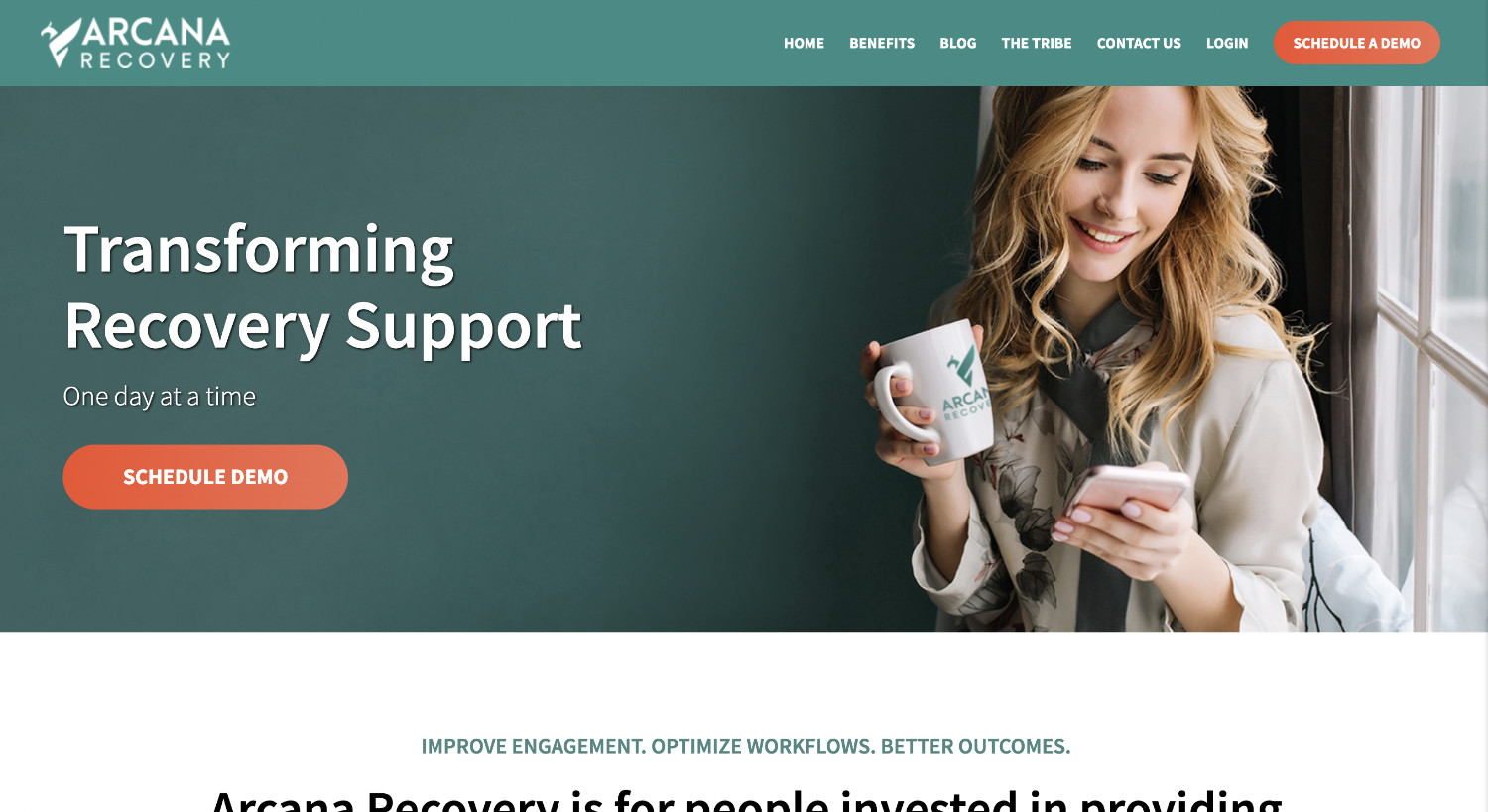
This project entailed a minor refresh of the Arcana Recovery website. I recoded the homepage, and added the tribe page, blog, blog archive and contact page. The website is plain HTML and CSS, there is no CMS used.
In the event that the page is down or moved, you can view a static screenshot of the homepage design here.
Skills: Development | Client: Arcana Recovery
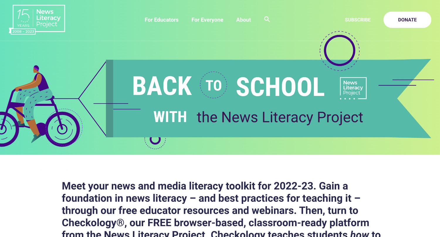
This is a WordPress page I created for the News Literacy Project to advertise their free e-learning platform, Checkology. I created the page using an existing WordPress template and added some custom HTML and CSS.
In the event that the page is down or moved, you can view a static screenshot of the page here.
Skills: Development | Company: News Literacy Project
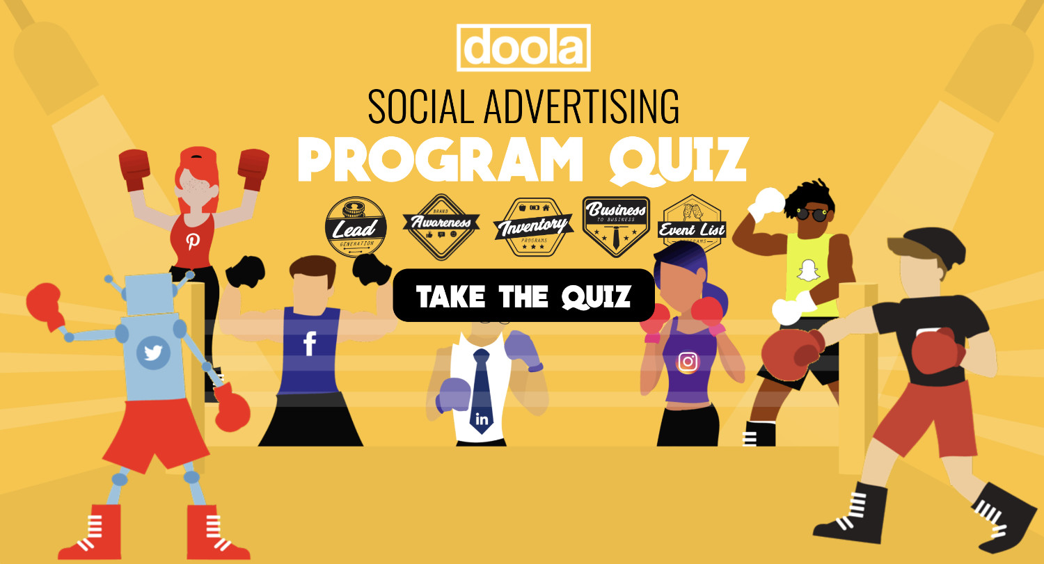
For this project I used HTML, CSS, and jQuery to create a social advertising program quiz for a client. Depending on the answers the user chooses, the quiz will recommend them a different program to sign up for that the company offers.
Skills: Development | Client: Doola
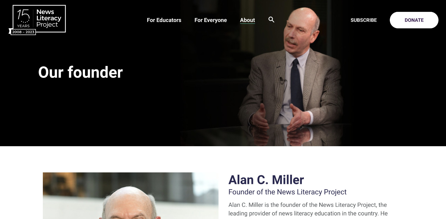
This is a WordPress page I created for the News Literacy Project to highlight their founder, Alan C. Miller. I created the page by customizing an existing WordPress template.
In the event that the page is down or moved, you can view a static screenshot of the page here.
Skills: Development | Company: News Literacy Project
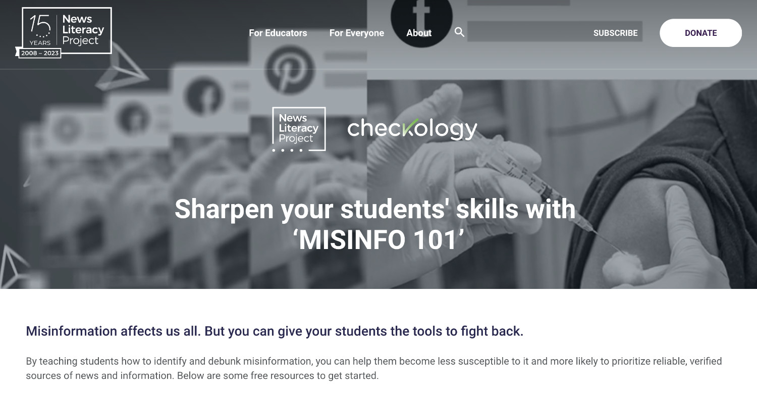
This is a WordPress page I created for the News Literacy Project to advertise their 'Misinfo 101' course that they offer on their free e-learning platform, Checkology. The page goes over what the course offers and how to sign up for it.
In the event that the page is down or moved, you can view a static screenshot of the page here.
Skills: Development | Company: News Literacy Project
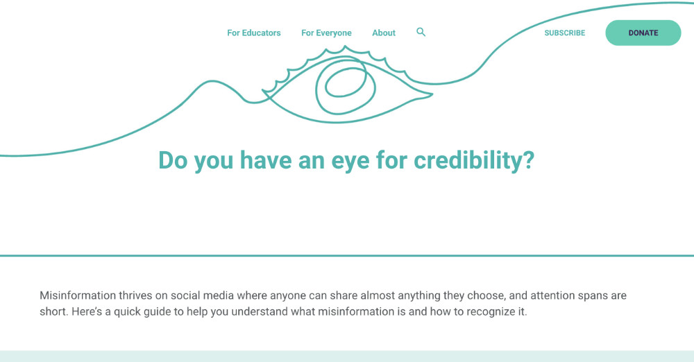
This is a WordPress page I created for the News Literacy Project. The page serves as a companion piece for a quiz about misinformation and disinformation. At the end of taking the quiz, the user is directed to the landing page I made which offers them further resources to learn about misinformation and how to combat it. I created this page by customizing an existing WordPress template.
In the event that the page is down or moved, you can view a static screenshot of the page here.
Skills: Development | Company: News Literacy Project
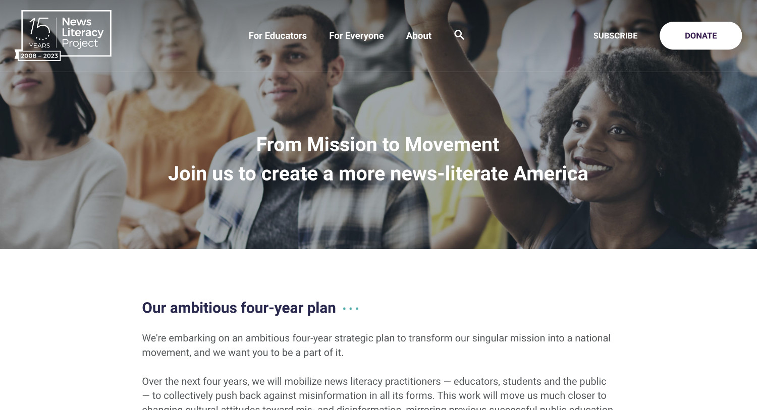
This is a WordPress page I created for the News Literacy Project. The page serves to outline the company's strategic four-year plan. I created this page by customizing an existing WordPress template.
In the event that the page is down or moved, you can view a static screenshot of the page here.
Skills: Development | Company: News Literacy Project
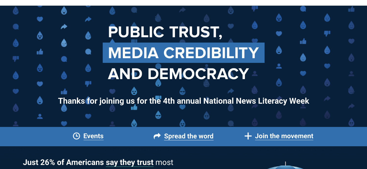
National News Literacy Week (NNLW) is a yearly event put on by the News Literacy Project (NLP). This year for NNLW 2023, I coded the landing page. The page highlights NLP resources, events, and reports associated with NNLW, as well as sponsors and ways to get involved with NNLW.
In the event that the page is down or moved, you can view a static screenshot of the page here.
Skills: Development | Company: News Literacy Project